Images are the single largest contributor to page weight on the modern web. For UK businesses, where Google's Core Web Vitals directly influence search rankings and user experience metrics determine whether visitors convert or bounce, image optimisation is not a cosmetic concern — it is a fundamental business requirement. A slow-loading website costs you customers, damages your search visibility, and undermines the credibility you have worked hard to build.
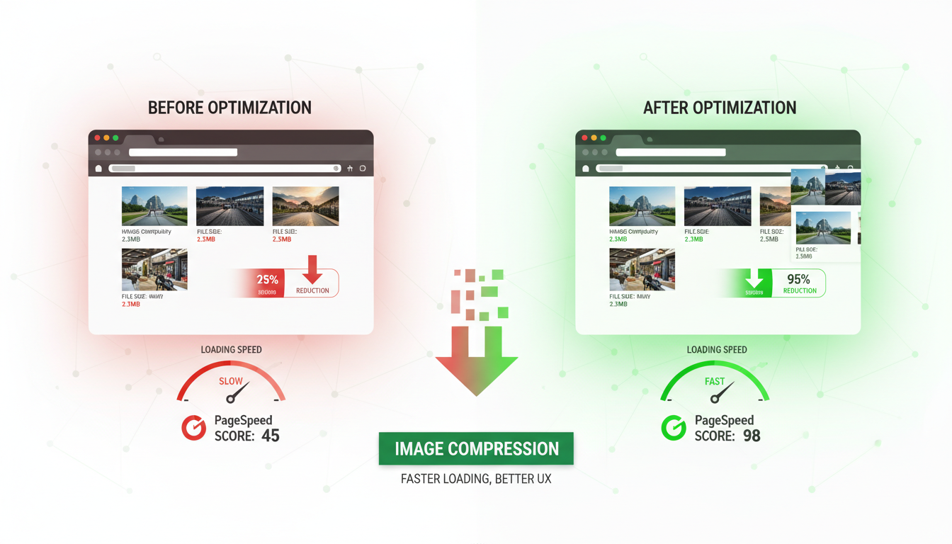
Research consistently shows that UK consumers are impatient with slow websites. A one-second delay in page load time reduces conversions by 7%, and 53% of mobile users abandon a page that takes longer than three seconds to load. Given that images typically account for 50-80% of total page weight, optimising them is the single most impactful performance improvement most UK businesses can make.
This guide provides a comprehensive, practical framework for image optimisation. It covers format selection, compression techniques, responsive images, lazy loading, CDN delivery, and the tools and workflows that make optimisation sustainable. Whether you are a business owner managing your own WordPress site or a developer building custom web applications, these techniques will help you deliver faster, better-performing websites.
The business case for image optimisation is particularly compelling for UK e-commerce businesses, where every fraction of a second matters during peak trading periods such as Black Friday, the January sales, and seasonal promotions. During these high-traffic events, server resources are stretched and network congestion increases, amplifying the impact of oversized images. A product catalogue page with twenty unoptimised images might take eight seconds to load on mobile during peak traffic, compared to under two seconds with properly optimised images — the difference between a completed purchase and an abandoned basket. Investment in image optimisation delivers returns year-round but pays for itself many times over during these critical trading windows.
Understanding Image Formats
Choosing the right image format is the foundation of effective optimisation. Each format has specific strengths and weaknesses, and using the wrong format for a given image type can result in files that are many times larger than necessary.
JPEG remains the workhorse format for photographs and complex images with many colours and gradients. JPEG uses lossy compression, meaning it discards some image data to achieve smaller file sizes. At quality settings between 75 and 85, JPEG produces visually indistinguishable results from the original while reducing file size by 60-80%. JPEG does not support transparency.
PNG is ideal for images that require transparency (such as logos with transparent backgrounds), images with sharp edges and text, and graphics with limited colour palettes. PNG uses lossless compression, meaning no image data is discarded, but file sizes are typically larger than JPEG for photographic content. PNG-8 (256 colours) produces very small files for simple graphics, while PNG-24 (16 million colours) is larger but supports full transparency.
WebP is Google's modern image format that provides superior compression for both photographic and graphic content. WebP typically produces files 25-35% smaller than equivalent JPEG images and 26% smaller than PNG images, with comparable visual quality. WebP supports both lossy and lossless compression, as well as transparency and animation. Browser support is now universal across all modern browsers.
AVIF is the newest format, offering even better compression than WebP — typically 20% smaller at equivalent quality. Browser support is growing rapidly and now covers Chrome, Firefox, and Safari. AVIF is particularly effective for photographic content and is becoming the preferred format for performance-focused websites.
Selecting the optimal format for each image requires careful consideration of its specific characteristics. A practical rule of thumb for UK businesses is to use AVIF as the primary format with WebP as a fallback and JPEG as the final fallback, delivered through the HTML picture element. For logos, icons, and simple graphics, SVG should always be the first choice where possible, as vector graphics scale perfectly to any screen density without any increase in file size. For decorative illustrations with limited colour palettes, PNG-8 remains an efficient option that is universally supported. The decision tree is straightforward: if the image is a graphic or icon, use SVG; if it is a photograph, use AVIF with WebP and JPEG fallbacks; if it requires transparency and is not suitable for SVG, use WebP or PNG.
| Format | Best For | Compression | Transparency | Browser Support | Typical Saving vs JPEG |
|---|---|---|---|---|---|
| JPEG | Photographs, complex images | Lossy | No | Universal | Baseline |
| PNG | Logos, graphics, transparency | Lossless | Yes | Universal | Larger (use for graphics only) |
| WebP | All image types | Both | Yes | 97%+ global | 25-35% smaller |
| AVIF | Photographs, hero images | Both | Yes | 90%+ global | 40-50% smaller |
| SVG | Icons, illustrations, logos | Vector (scalable) | Yes | Universal | N/A (resolution independent) |
Compression Techniques That Work
Compression is where the most dramatic file size reductions occur. The key is finding the quality threshold below which compression artefacts become visible, then compressing to just above that threshold. For most images on UK business websites, this sweet spot delivers files 60-80% smaller than the original with no perceptible quality loss.
For JPEG images, a quality setting of 80 (on a scale of 1-100) typically produces excellent results for web display. Below 70, compression artefacts — banding, blurring, and blockiness — become visible, particularly in areas of smooth gradients such as skies and skin tones. Above 85, file size increases significantly with negligible visual improvement. The difference between quality 85 and quality 100 is often a 300% increase in file size with no visible difference on screen.
For WebP images, a quality setting of 75-80 produces results comparable to JPEG at quality 85, with significantly smaller file sizes. WebP's compression algorithm is more efficient at preserving detail at lower quality settings, which is one reason it produces consistently smaller files.
Beyond quality-based compression, metadata stripping provides additional file size savings with zero visual impact. Digital photographs contain extensive EXIF metadata from the camera — shutter speed, aperture, focal length, GPS coordinates, camera model, and date taken — as well as ICC colour profiles and embedded thumbnail previews. This metadata can account for 10-15% of the total file size and serves no purpose when the image is displayed on a website. Stripping metadata during the optimisation process removes this overhead entirely. For UK businesses concerned about data privacy and GDPR compliance, removing EXIF data is also good practice — GPS coordinates embedded in staff photographs, for example, could inadvertently reveal office locations or personal home addresses.
Responsive Images: Serving the Right Size
One of the most common mistakes on UK business websites is serving the same large image to every device. A 2000px-wide hero image designed for desktop displays is entirely wasted on a mobile phone with a 375px-wide viewport — the browser downloads the full 2000px image and then scales it down, wasting bandwidth and slowing the page load for mobile users who are often on slower connections.
Responsive images solve this problem by serving different image sizes based on the viewer's device and viewport. HTML provides two mechanisms for this: the srcset attribute and the picture element.
The srcset attribute tells the browser about multiple versions of the same image at different sizes, allowing the browser to choose the most appropriate one based on the viewport width and device pixel ratio. For example, you might provide a 400px version for mobile, an 800px version for tablets, and a 1200px version for desktops. The browser downloads only the version it needs.
The picture element provides more control by allowing you to specify different image formats as well as sizes. This enables you to serve AVIF to browsers that support it, WebP to those that support WebP but not AVIF, and JPEG as a fallback for older browsers. This format negotiation happens automatically in the browser without any JavaScript.
For UK businesses that manage large volumes of images — e-commerce sites, property portals, media companies — an image CDN (Content Delivery Network) automates the entire optimisation process. Services such as Cloudflare Images, Imgix, and Cloudinary accept your original images and automatically generate optimised versions in the right format, size, and quality for each visitor. The CDN also serves images from edge locations close to the user, further reducing load times. For a UK user, images might be served from a London or Manchester edge node, delivering sub-50ms response times regardless of where the origin server is located. Pricing typically starts at £15-£50 per month for SME-level usage.
Lazy Loading: Defer What Is Not Visible
Lazy loading is a technique that defers the loading of images that are not currently visible in the browser viewport. Instead of downloading every image on the page when it first loads, lazy loading downloads images only when the user scrolls them into view (or is about to scroll them into view). This dramatically reduces the initial page load time, particularly for long pages with many images.
Modern browsers support native lazy loading through the loading="lazy" attribute on img elements. This requires no JavaScript, no external libraries, and no complex configuration — simply add the attribute to any image that is below the fold (not visible in the initial viewport). The browser handles the rest, loading images as the user scrolls down the page.
For images that are visible in the initial viewport — hero images, above-the-fold product photos, and header logos — do not use lazy loading. These images should load immediately to ensure the fastest possible Largest Contentful Paint (LCP), which is one of Google's Core Web Vitals and a direct ranking factor.
A critical but often overlooked aspect of responsive image implementation is specifying explicit width and height attributes on every image element. Without these attributes, the browser cannot allocate the correct amount of space for the image before it loads, causing the page layout to shift as images appear — a problem known as Cumulative Layout Shift (CLS), which is one of the three Core Web Vitals metrics. By specifying width and height attributes that match the image aspect ratio, you allow the browser to reserve the correct space in the layout before the image downloads. Combined with CSS that sets max-width to 100% and height to auto, this approach prevents layout shift while still allowing images to resize responsively across all viewport sizes.
For above-the-fold images, the opposite of lazy loading applies — you want these images to load as quickly as possible. The preload link element tells the browser to begin downloading a critical image before it encounters the img element in the HTML, shaving hundreds of milliseconds off the load time. This technique is particularly effective for hero images and background images referenced in CSS rather than HTML, as these are normally discovered late in the page loading process. Adding a preload hint in the document head ensures the browser begins downloading the image immediately, directly improving your Largest Contentful Paint score. Use preload sparingly — preloading too many resources dilutes its effectiveness and can actually slow down the loading of other critical resources such as stylesheets and scripts.
Optimised Image Strategy
- Modern formats (WebP/AVIF) with JPEG fallback
- Responsive srcset for every viewport size
- Compression at quality 75-85 threshold
- Lazy loading for below-the-fold images
- Preload hints for critical above-fold images
- CDN delivery from UK edge locations
- Automated optimisation in build pipeline
- Regular performance audits with Lighthouse
Common Image Mistakes
- Uploading original camera files (5MB+ each)
- Using PNG for photographs (3-5x larger than JPEG)
- Serving 2000px images to mobile devices
- Loading all images on page load regardless
- No preload for hero images (slow LCP)
- Images served from origin server only
- Manual optimisation (inconsistent, forgotten)
- Never measuring actual page performance
Tools for Image Optimisation
A range of tools is available for UK businesses and developers, from simple online tools to sophisticated build-pipeline integrations. The right choice depends on your technical capability and the volume of images you manage.
For non-technical users managing a small business website, tools like TinyPNG (free for up to 500 images per month) and Squoosh (Google's free browser-based tool) provide simple drag-and-drop optimisation. These tools are excellent for occasional use but impractical for sites with hundreds or thousands of images.
For WordPress sites — which power a significant percentage of UK business websites — plugins such as ShortPixel, Imagify, and Smush automate the optimisation of every image uploaded to the media library. These plugins compress images on upload, generate WebP versions automatically, and can bulk-optimise existing images. Pricing starts from free (with limits) to approximately £5-£15 per month for unlimited usage.
For developers building custom websites, command-line tools such as Sharp (Node.js), Pillow (Python), and ImageMagick provide programmatic image processing. These tools integrate into build pipelines and CI/CD workflows, ensuring that every image is optimised before deployment. Modern frameworks like Next.js include built-in image optimisation components that handle format conversion, resizing, and lazy loading automatically.
Building a Sustainable Optimisation Workflow
The most effective image optimisation is not a one-time project but an ongoing workflow built into your content publishing and development processes. For UK businesses that regularly add new content — blog posts, product listings, portfolio items, news articles — every new image must go through the same optimisation pipeline to maintain the performance gains you have achieved. Without a sustainable workflow, performance inevitably degrades as unoptimised images accumulate over time, gradually eroding the improvements made during the initial optimisation effort.
For development teams, integrating image optimisation into your build pipeline is the most reliable approach. Tools such as Sharp, imagemin, and squoosh-cli can be configured as build steps that automatically compress, resize, and convert images during the deployment process. This ensures that every image deployed to production meets your quality and size standards, regardless of how it was uploaded originally. Git hooks can prevent oversized images from being committed to the repository, catching problems before they reach the build pipeline. For particularly large projects, a dedicated image processing microservice that handles optimisation asynchronously can decouple image processing from the main deployment workflow.
For content teams using WordPress or similar CMS platforms, a combination of upload-time plugins and periodic bulk optimisation provides the necessary coverage. Configure your chosen optimisation plugin to process every image on upload, and schedule monthly bulk scans to catch any images that may have bypassed the automated process. Establishing clear guidelines for your content team — maximum upload dimensions, preferred formats, descriptive file naming conventions — reduces the optimisation burden and ensures consistency across your website. Document these guidelines and include them in your content publishing workflow so that image optimisation becomes a natural part of content creation rather than an afterthought.
Measuring the Impact
Image optimisation is only effective if you measure the results. Use Google Lighthouse (built into Chrome DevTools), Google PageSpeed Insights, and WebPageTest to audit your pages before and after optimisation. These tools identify specific images that need attention, measure the impact of changes on Core Web Vitals, and provide actionable recommendations.
For UK businesses competing in local search, Core Web Vitals are particularly important. Google uses these metrics as ranking signals, and pages that meet the "good" thresholds for LCP (under 2.5 seconds), FID/INP (under 200 milliseconds), and CLS (under 0.1) receive a ranking boost compared to slower competitors. Since image optimisation is the single most impactful way to improve LCP, it directly affects your search visibility and the traffic — and revenue — that follows.
Establish a regular performance monitoring cadence. Check your Core Web Vitals monthly using Google Search Console's Core Web Vitals report, which shows real-world performance data from actual users visiting your site. If scores decline, investigate whether new unoptimised images have been added or whether other changes have affected performance.
Ready to Accelerate Your Website?
Cloudswitched delivers performance-focused web development for UK businesses. From comprehensive image optimisation and CDN configuration to complete website builds engineered for speed, our team ensures your site loads fast, ranks well, and converts visitors into customers.

CloudSwitched
London-based managed IT services provider offering support, cloud solutions and cybersecurity for SMEs.


