Your business website might look beautiful, but if it is not converting visitors into leads and customers, it is not doing its job. For UK small and medium-sized businesses, the website is often the single most important marketing asset — the place where potential customers form their first impression and decide whether to enquire, purchase, or move on to a competitor.
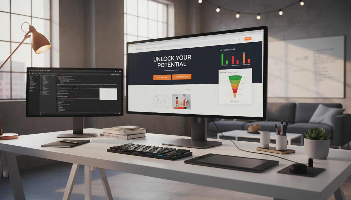
Landing pages — focused, single-purpose pages designed to drive a specific action — are the most effective tool for turning website traffic into business results. Unlike your homepage, which tries to serve multiple audiences and purposes, a landing page has one goal: to persuade the visitor to take a specific action, whether that is filling out a contact form, booking a consultation, downloading a guide, or making a purchase.
This guide draws on real conversion data from UK businesses to explain what makes landing pages work, the elements that drive conversions, and the mistakes that kill them.
What Makes a Landing Page Different from a Regular Web Page?
A landing page is fundamentally different from a standard website page in both design and purpose. Your homepage, service pages, and blog posts are designed to inform, educate, and provide navigation options. A landing page is designed to convert — to guide the visitor towards a single, specific action with minimal distractions.
Effective landing pages typically have no main navigation menu, no sidebar, no footer links to other pages, and no competing calls to action. Every element on the page — the headline, the copy, the images, the testimonials, and the form — exists solely to support the conversion goal. This focused approach is what makes landing pages dramatically more effective than sending traffic to a general website page.
The single most important principle of landing page design is focus. Each landing page should have exactly one goal and one call to action. If you want visitors to fill out a contact form, every element on the page should support that goal. Do not add links to your blog, social media buttons, navigation menus, or alternative calls to action. Every additional option you provide is an opportunity for the visitor to leave without converting. The best-performing landing pages are ruthlessly focused on a single outcome.
Why UK Businesses Need Dedicated Landing Pages
For UK small and medium-sized enterprises, the case for dedicated landing pages is particularly compelling. The UK digital marketplace is fiercely competitive, with British consumers among the most digitally active in Europe. Over 90 per cent of the adult population is online, and there is a growing expectation that businesses will deliver fast, focused, and professional digital experiences. When you direct paid traffic from Google Ads, social media campaigns, or email marketing to your homepage, you force visitors to navigate through multiple menus, messages, and competing calls to action before they find what they were looking for. Many will not bother. They will leave and click on a competitor instead.
A dedicated landing page eliminates this friction entirely. If you are running a Google Ads campaign for IT support in Manchester, your ad should direct visitors to a landing page specifically about IT support in Manchester, not your homepage or your generic services page, but a page that mirrors the promise of the ad and delivers a clear, immediate path to taking action. This alignment between the ad message and the landing page content is called message match, and it is one of the strongest predictors of conversion performance.
Landing pages also give you the ability to run targeted campaigns simultaneously without confusing your site structure. You can have separate landing pages for different services, different geographic areas, different customer segments, and different marketing channels, each one tailored precisely to its audience. A managed services provider, for example, might have one landing page targeting small business owners worried about cybersecurity, another targeting growing firms in need of cloud migration support, and a third targeting organisations that have just experienced a data breach and need immediate incident response. Each page speaks directly to a specific concern and presents a relevant solution.
The Anatomy of a High-Converting Landing Page
After analysing hundreds of landing pages for UK businesses, clear patterns emerge in what drives conversions. The most effective pages consistently include these elements, arranged in a specific hierarchy.
It is worth understanding that these elements work together as a system, not as isolated components. A brilliant headline will fail if the supporting copy does not deliver on its promise. A perfect form will go unfilled if the page lacks social proof to build trust. The best-performing landing pages create a seamless narrative from the first glance to the final click, guiding the visitor through a logical sequence of attention, interest, desire, and action.
Visual Hierarchy and Layout Principles
The visual layout of your landing page determines how visitors consume information and whether they reach your call to action. Research into eye-tracking patterns shows that visitors typically scan web pages in an F-shaped pattern, reading across the top, scanning down the left side, and making occasional horizontal movements into the content. Effective landing pages are designed to work with this natural scanning behaviour, placing the most important elements along these sight lines.
The area visible without scrolling is the most valuable real estate on your landing page. Your headline, sub-headline, hero image or video, and primary call to action should all be visible in this area. While visitors will scroll if the content above the fold engages them, your page must communicate its core value proposition and present the opportunity to convert within the first viewport. For UK businesses, this is particularly important on mobile devices, where screen space is limited and attention spans are shorter.
White space is not wasted space. It is a critical design element that improves readability, creates visual breathing room, and directs attention to key elements. Pages that are crammed with text, images, and buttons feel overwhelming and untrustworthy. Generous use of white space around your headline, call to action, and key benefit statements makes them stand out and gives the page a premium, professional feel that builds confidence in your brand.
1. A Compelling Headline
Your headline is the first thing visitors see and the single most important element on the page. It must immediately communicate the value proposition — what the visitor will get and why it matters to them. The best headlines are specific, benefit-focused, and address the visitor's primary concern or desire. "Get a Free IT Assessment for Your Business" outperforms "Contact Us" by a factor of three or more, because it tells the visitor exactly what they will receive.
2. Supporting Sub-Headline
The sub-headline expands on the headline, adding detail or addressing a secondary concern. If your headline promises a free IT assessment, your sub-headline might add "Our certified engineers will review your infrastructure and deliver a detailed report within 48 hours." This adds specificity and reduces uncertainty.
3. Social Proof
Testimonials, case studies, client logos, review scores, and industry certifications all serve as social proof — evidence that other people and organisations trust and value your service. For UK businesses, displaying logos of well-known clients, Google review ratings, and industry accreditations like ISO 27001 or Cyber Essentials builds trust and reduces the perceived risk of engaging with you.
4. Benefit-Focused Copy
The body copy of your landing page should focus on benefits, not features. Your visitors do not care about the technical specifications of your service — they care about what it will do for them. "Reduce your IT downtime by 90%" is more compelling than "We use advanced RMM monitoring tools." Translate every feature into the benefit it delivers.
5. A Clear, Prominent Call to Action
Your call to action (CTA) — typically a form or button — should be immediately visible without scrolling. Use action-oriented language that tells the visitor exactly what will happen: "Book Your Free Consultation" rather than "Submit." Make the CTA button visually prominent with a contrasting colour that stands out from the rest of the page.
Relative impact of landing page elements on conversion rates (UK marketing data)
The Conversion Killers: What to Avoid
Understanding what kills conversions is just as important as knowing what drives them. These are the most common mistakes we see on UK business landing pages.
Diagnosing Conversion Problems on Existing Pages
If your existing landing pages are underperforming, the first step is diagnosis rather than guesswork. Heat mapping tools such as Hotjar or Microsoft Clarity show you exactly where visitors are clicking, how far they are scrolling, and which elements they are engaging with. Session recordings allow you to watch real visitor interactions and identify specific friction points, whether visitors are trying to click on an image that is not a link, or scrolling past your call to action without noticing it.
Conversion funnel analysis reveals where visitors are dropping out of the process. If your landing page receives strong traffic but few form submissions, the problem likely lies in the page content, layout, or form design. If visitors are starting to fill out the form but abandoning it before completion, the form itself is the issue, perhaps asking for too much information, lacking clear field labels, or not displaying properly on mobile devices. Understanding where the breakdown occurs allows you to focus your optimisation efforts on the elements that will deliver the greatest improvement.
For UK businesses, it is also worth reviewing your landing pages from a trust perspective. British consumers are particularly cautious about sharing personal information online, and your page must overcome this natural scepticism. Check that your privacy policy is easily accessible, that your contact details are visible, that you display relevant accreditations and certifications, and that your testimonials feel genuine and verifiable. A page that looks professional but lacks trust signals will struggle to convert even if every other element is well-optimised.
Conversion Boosters
- Single, focused call to action
- Headline addresses visitor's problem
- Short form (3-5 fields maximum)
- Fast page load (under 3 seconds)
- Mobile-optimised layout
- Real testimonials with names and photos
- Specific, quantified benefits
- Trust signals (certifications, reviews)
Conversion Killers
- Multiple competing calls to action
- Generic headline ("Welcome to our site")
- Long form asking for unnecessary details
- Slow loading with heavy images or scripts
- Desktop-only design that fails on mobile
- No social proof or trust signals
- Feature-focused rather than benefit-focused
- Navigation menu that leads visitors away
Form Optimisation: Where Conversions Happen
The form on your landing page is where the conversion actually occurs, and it is also where most potential conversions are lost. Every additional form field you add reduces your conversion rate. Research consistently shows that reducing form fields from seven to four can increase conversions by 50 percent or more.
For most UK B2B businesses, the optimal form includes just three to five fields: name, email address, phone number, and perhaps company name and a brief message field. Resist the temptation to ask for job title, company size, budget, or other qualifying information at this stage — you can gather that information during the follow-up conversation. The goal of the form is to start the conversation, not to complete the sale.
Progressive Profiling and Smart Forms
For businesses that genuinely need more information from their leads, progressive profiling offers a practical solution. Rather than presenting a lengthy form upfront, progressive profiling collects basic information in the initial form and then gathers additional details over subsequent interactions, through follow-up emails, phone conversations, or secondary forms on thank-you pages. This approach maintains high conversion rates on the landing page whilst still building comprehensive lead profiles over time.
Smart forms take this a step further by dynamically adjusting the fields displayed based on what is already known about the visitor. If a returning visitor has already provided their name and email address, the form can skip those fields and ask for additional information instead. This technology is available through most modern marketing automation platforms and can significantly improve the experience for repeat visitors.
Trust Elements Within Forms
The area immediately surrounding your form is critical for conversion. Place reassuring trust elements close to the form fields, such as a brief privacy statement, relevant security badges, or a note explaining what will happen after submission. For UK businesses collecting personal data, a clear statement about GDPR compliance and how the submitted information will be used is not only legally required but also builds trust. Including a link to your privacy policy directly beneath the form demonstrates transparency and professionalism.
The submit button itself deserves careful consideration. Generic labels are passive and uninspiring. Action-oriented labels that reinforce the value proposition consistently outperform generic alternatives. The button should be large enough to tap easily on mobile devices, styled in a colour that contrasts with the surrounding page elements, and positioned prominently at the bottom of the form.
| Number of Form Fields | Average Conversion Rate | Relative Performance |
|---|---|---|
| 3 fields | 5.8% | Highest conversion |
| 4-5 fields | 4.2% | Good balance of conversion and data |
| 6-7 fields | 2.9% | Below average |
| 8-10 fields | 1.7% | Significant drop-off |
| 10+ fields | 0.8% | Most visitors abandon |
Page Speed: The Silent Conversion Killer
Page speed has a dramatic impact on conversion rates, yet it is one of the most commonly overlooked factors. Google research shows that 53 percent of mobile users abandon a page that takes longer than three seconds to load. For every additional second of load time, conversion rates drop by approximately seven percent.
To optimise landing page speed, compress all images (use WebP format where possible), minimise the use of third-party scripts, use a content delivery network (CDN), and ensure your hosting platform is fast and reliable. Tools like Google PageSpeed Insights and GTmetrix can identify specific performance bottlenecks on your pages.
For UK businesses, hosting your landing pages on UK-based servers or using a CDN with UK edge locations ensures the fastest possible load times for your target audience. Every millisecond counts when it comes to preventing visitors from bouncing before your page even loads.
Technical Performance Essentials
Achieving optimal page speed requires attention to several technical factors. Image optimisation is typically the single biggest opportunity, as uncompressed images are the most common cause of slow-loading landing pages. Convert images to modern formats such as WebP or AVIF, which deliver superior compression without visible quality loss. Use responsive image techniques to serve appropriately sized images for each device, ensuring that mobile visitors are not downloading desktop-resolution images over potentially slower connections.
Third-party scripts, including analytics trackers, chat widgets, social media embeds, and advertising pixels, can add significant load time. Audit every third-party script on your landing page and remove any that are not essential for tracking or functionality. For necessary scripts, use asynchronous loading so they do not block the page from rendering. Consider deferring non-critical scripts until after the main content has loaded, ensuring that visitors see your headline and call to action as quickly as possible.
Server response time is another critical factor. If your web hosting provider is slow or your server is located far from your target audience, every page request starts with an unnecessary delay. For UK businesses targeting UK customers, ensure your hosting infrastructure includes UK-based servers or, at minimum, a CDN with UK points of presence. Modern hosting platforms built on edge computing architectures deliver content from the server closest to each visitor, virtually eliminating geographic latency and providing consistent performance regardless of where in the UK your visitors are located.
Render-blocking resources, specifically CSS and JavaScript files that must be fully downloaded and processed before the page can be displayed, are a frequent source of performance problems. Minimise and combine CSS files, inline critical styles needed for above-the-fold content, and defer non-essential JavaScript. These optimisations can reduce the time to first meaningful paint by several hundred milliseconds, which translates directly into lower bounce rates and higher conversion rates.
A/B Testing: The Path to Continuous Improvement
The most successful UK businesses do not create a single landing page and hope for the best — they test continuously. A/B testing (also called split testing) involves creating two or more versions of a landing page with a single difference between them and measuring which version produces more conversions.
Start by testing the elements with the biggest potential impact: headlines, call-to-action text, form length, and hero images. Run each test for at least two weeks or until you have sufficient traffic for statistical significance (typically 100 or more conversions per variation). Then implement the winning version and test the next element.
Over time, this iterative approach compounds small improvements into significant gains. A landing page that starts at a two percent conversion rate can often reach five percent or higher through systematic testing — more than doubling the number of leads from the same traffic.
Building a Testing Methodology
Effective A/B testing requires discipline and a structured approach. Before you change anything, establish a clear baseline by measuring your current conversion rate over a statistically meaningful period. Document your hypothesis for each test, explaining not just what you are changing but why you believe it will improve conversions. A testable hypothesis provides insight regardless of whether it succeeds or fails, and it prevents the random, undirected changes that waste time without generating actionable learning.
Prioritise your tests using an impact-versus-effort framework. Changes to headlines, call-to-action text, and hero images typically deliver the highest impact with relatively low effort. Layout restructuring, form redesign, and page speed optimisation require more effort but can deliver transformative results. Minor visual changes, such as button colour, font size, and image selection, generally have the smallest impact and should be tested last, after the high-impact elements have been optimised.
Beyond Simple A/B Testing
As your testing programme matures, consider multivariate testing, which involves testing multiple elements simultaneously to identify the optimal combination. While A/B testing changes one element at a time, multivariate testing might simultaneously test three headlines, two images, and two button colours to find the best-performing combination. This approach requires significantly more traffic to achieve statistical significance but can uncover interactions between elements that sequential A/B testing would miss.
Personalisation represents the next evolution beyond testing. Rather than finding a single page version that works best on average, personalisation tailors the landing page experience to individual visitors based on their characteristics, such as the marketing channel they arrived from, their geographic location, their device type, or their behaviour on previous visits. A visitor arriving from a LinkedIn ad targeting finance directors, for instance, might see different headlines, testimonials, and case studies than a visitor arriving from a general search query. This level of personalisation requires more sophisticated tooling and sufficient traffic to segment effectively, but the conversion improvements can be substantial for UK businesses with diverse customer bases.
Whatever testing approach you adopt, the most important principle is consistency. Sporadic, undocumented testing produces unreliable results and wasted effort. Establish a regular testing cadence and document every test and its results. Over six to twelve months, this disciplined approach will transform your landing pages from guesswork into a data-driven, continuously improving conversion engine.
Need Landing Pages That Convert?
Cloudswitched builds high-converting landing pages and websites for UK businesses. Our web development team combines compelling design with data-driven optimisation to create pages that turn visitors into customers. Whether you need a single landing page or a complete website overhaul, we deliver results. Get in touch to discuss your project.
DISCUSS YOUR WEB PROJECT
CloudSwitched
London-based managed IT services provider offering support, cloud solutions and cybersecurity for SMEs.


