More than half of all web traffic in the United Kingdom now comes from mobile devices. For many UK businesses, particularly those in retail, hospitality, and professional services, the figure is even higher — often exceeding 70%. Yet a surprising number of UK SME websites are still designed primarily for desktop screens, with the mobile experience treated as an afterthought. In 2026, this approach is not merely outdated — it is actively damaging your business.
Mobile-first web design is a methodology that reverses the traditional approach to building websites. Instead of designing for desktop screens first and then adapting the layout for smaller devices, mobile-first design starts with the mobile experience and progressively enhances it for larger screens. This is not simply a design preference — it is a strategic approach that directly impacts your search engine rankings, conversion rates, user experience, and ultimately, your revenue.
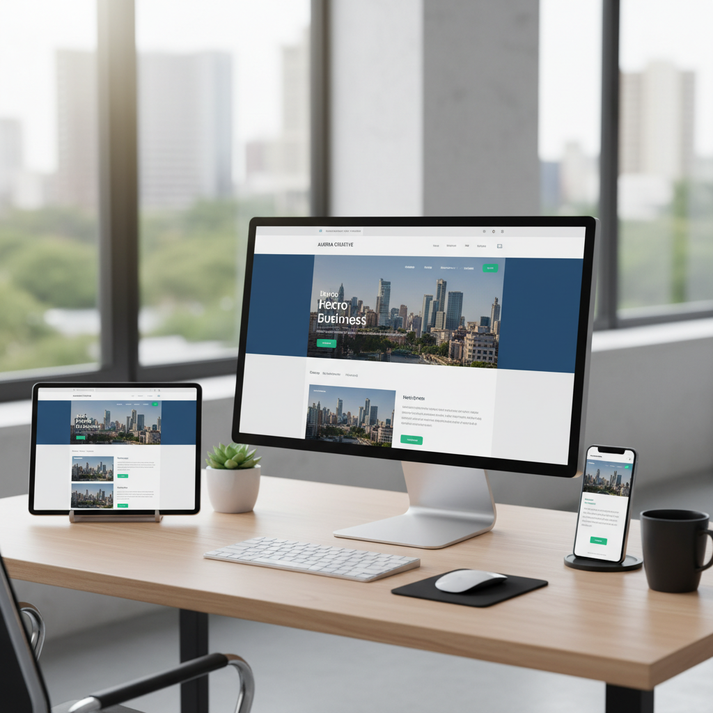
This guide explains what mobile-first design means in practice, why it matters for UK businesses, and how to implement it effectively.
What Is Mobile-First Design?
Mobile-first design means designing for the smallest screen first, then adding complexity and additional content as the screen size increases. The mobile layout is the default, and desktop is the enhancement — not the other way around.
This approach was first articulated by Luke Wroblewski in 2009 and has since become the industry standard for web development. Google adopted mobile-first indexing in 2019, meaning it uses the mobile version of your website as the primary version for search ranking purposes. If your mobile experience is poor, your search rankings suffer — regardless of how good your desktop site looks.
In practical terms, mobile-first design involves starting with a single-column layout optimised for touch interaction on a small screen, then using CSS media queries to progressively add multi-column layouts, larger images, and additional features for tablet and desktop screens. The content hierarchy, navigation structure, and core functionality are all designed with mobile constraints in mind first.
Since 2019, Google predominantly uses the mobile version of your website's content for indexing and ranking. If your mobile site has less content, fewer links, or poorer structure than your desktop version, your search rankings will be based on the weaker mobile version. This is not optional — all websites are now evaluated this way. A mobile-first design ensures that your strongest content is always present on the version Google evaluates.
Why Desktop-First Design Fails on Mobile
The traditional approach to web design — creating a full desktop layout and then attempting to squeeze it onto a mobile screen — creates numerous problems that directly affect business outcomes.
Performance Issues
Desktop-first websites typically load large images, complex scripts, and heavy stylesheets designed for powerful desktop computers with fast broadband connections. When the same resources are loaded on a mobile device over a 4G connection, the result is a slow, bloated experience. Mobile users on congested networks may wait 8-10 seconds for a desktop-first page to load, while a mobile-first equivalent loads in 2-3 seconds.
Navigation Nightmares
Desktop navigation menus with multiple levels, hover-activated dropdowns, and dozens of links simply do not work on touchscreens. Attempting to tap a small link in a desktop-designed navigation menu on a mobile phone is an exercise in frustration. Mobile-first design addresses this from the start with touch-friendly navigation patterns, adequately sized tap targets, and simplified menu structures.
Content Overload
Desktop screens offer generous real estate for sidebars, promotional banners, and supplementary content. On mobile, this additional content pushes the primary content down the page, forces excessive scrolling, and dilutes the user's focus. Mobile-first design forces you to prioritise — deciding what content is essential and presenting it prominently, rather than cluttering the page with everything that fits on a 27-inch monitor.
Core Principles of Mobile-First Design
1. Content Prioritisation
Mobile screens force you to make hard decisions about what content matters most. This constraint is actually a benefit — it results in clearer, more focused pages that communicate your message more effectively on every screen size. Start by identifying the single most important action you want visitors to take on each page, and design the mobile layout to guide them towards that action.
2. Touch-Friendly Interaction
Design all interactive elements for touch input. Buttons should be at least 44x44 pixels (Apple's recommended minimum tap target size). Links should have sufficient spacing to prevent accidental taps. Form fields should be large enough to tap comfortably. Avoid hover-dependent interactions, as touchscreens do not have a hover state.
3. Performance as a Feature
Speed is not an afterthought — it is a core design requirement. Optimise images for mobile by using modern formats like WebP and serving appropriately sized images based on the device's screen width. Minimise JavaScript and defer non-critical scripts. Use lazy loading for images below the fold. Target a Largest Contentful Paint (LCP) time of under 2.5 seconds, which is Google's threshold for a "good" experience.
4. Progressive Enhancement
Start with a fully functional mobile experience, then add enhancements for larger screens. On tablet, you might introduce a two-column layout. On desktop, you might add a sidebar, expand navigation menus, and display larger hero images. The key principle is that every user — regardless of device — gets a complete, functional experience, with larger screens getting a richer one.
Mobile-First Best Practices
- Design for the smallest screen first, then scale up
- Use responsive images that adapt to screen size
- Implement touch-friendly navigation with hamburger menus
- Keep forms short — minimise required fields on mobile
- Test on real mobile devices, not just browser emulators
- Optimise Core Web Vitals for Google ranking benefits
Common Mobile Design Mistakes
- Hiding content on mobile that exists on desktop
- Using tiny text that requires pinch-to-zoom
- Pop-ups that cover the entire mobile screen
- Forms that are painful to complete on a phone
- Fixed elements that consume precious mobile screen space
- Relying on desktop-only testing tools
Mobile-First vs Desktop-First: A Detailed Comparison
To make the differences between these two approaches concrete, the following table compares mobile-first and desktop-first design across the criteria that matter most to UK businesses. Each factor has a direct bearing on your site's performance, user satisfaction, and commercial results.
| Criterion | Mobile-First Approach | Desktop-First Approach |
|---|---|---|
| Initial design target | 320-480px viewport; content hierarchy decided under tight constraints | 1200-1440px viewport; layouts often rely on generous horizontal space |
| Page load speed (3G/4G) | Typically 1.5-3 seconds; assets are lean by default | Often 5-10 seconds; heavy assets must be stripped retroactively |
| Google ranking signal | Fully aligned with mobile-first indexing; strong Core Web Vitals | Penalised if mobile version degrades content or speed |
| Development cost (UK agency rates) | £5,000-£15,000 for a typical SME site; efficient from the start | £6,000-£18,000; additional responsive retro-fitting adds 15-25% to budget |
| Conversion rate on mobile | 1.5-2x higher than non-optimised equivalents | Baseline; mobile users frequently abandon complex layouts |
| Maintenance overhead | Single responsive codebase; updates apply to all breakpoints | Separate mobile fixes often required; higher ongoing QA effort |
The SEO Impact
The connection between mobile-first design and search engine optimisation is direct and significant. Google's Core Web Vitals — Largest Contentful Paint, Interaction to Next Paint, and Cumulative Layout Shift — are measured on the mobile version of your site and directly influence your search rankings.
UK businesses competing for local search visibility are particularly affected. When a potential customer searches for "accountant near me" or "IT support London" on their phone, Google prioritises websites that deliver a fast, stable, mobile-optimised experience. A slow, poorly optimised mobile site will rank below competitors who have invested in mobile-first design, regardless of how strong your desktop experience might be.
Conversion Rate Optimisation on Mobile
A mobile-first approach directly improves conversion rates. When users can easily find what they are looking for, navigate without frustration, and complete actions (filling out a contact form, making a purchase, booking an appointment) without fighting the interface, they are far more likely to convert. Studies consistently show that mobile-optimised sites achieve conversion rates 1.5 to 2 times higher than non-optimised equivalents.
For UK businesses, this translates directly to revenue. If your website receives 10,000 mobile visitors per month and a mobile-optimised redesign increases your conversion rate from 1% to 2%, that is 100 additional leads or sales every month — potentially worth thousands of pounds depending on your business model.
Mobile-First Design and UK Consumer Behaviour
Understanding how UK consumers actually use their mobile devices adds important context to the mobile-first argument. According to Ofcom's 2025 Communications Market Report, the average UK adult spends over four hours per day on their smartphone, with roughly half of that time spent browsing the web and using apps for shopping, research, and local services. This figure has grown year-on-year since 2019 and shows no sign of plateauing.
The behavioural patterns of UK mobile users differ meaningfully from desktop users, and these differences should inform your design decisions.
Micro-Moments and Intent
Google's research into "micro-moments" is especially relevant to UK businesses. Mobile searches tend to be high-intent — users are searching because they need something now. A 2025 study by BrightLocal found that 76% of UK consumers who search for a local business on their smartphone visit or contact that business within 24 hours. If your website is slow, difficult to navigate, or fails to present key information (address, phone number, opening hours, pricing) clearly on mobile, you are losing customers at the exact moment they are ready to buy.
Consider the journey of a typical customer searching for a plumber in Birmingham on a Saturday morning. They pull out their phone, type "emergency plumber near me," and Google returns a list of local businesses. They tap the first result. If the website takes six seconds to load, displays a desktop-width layout that requires pinching and zooming, and buries the phone number in a hamburger menu, they will press the back button within three seconds and call the next plumber on the list. That lost customer may have been worth hundreds of pounds in a single visit.
The Rise of Mobile Commerce in the UK
The UK is one of Europe's most mature mobile commerce markets. According to the Centre for Retail Research, mobile transactions accounted for over 45% of all UK e-commerce spending in 2025, totalling approximately £62 billion. For retailers, hospitality businesses, and service providers, this means that nearly half of potential online revenue is flowing through mobile screens. A website that creates friction on mobile is not just an inconvenience — it is a revenue leak.
Mobile commerce expectations have also risen sharply. UK consumers now expect one-tap purchasing, autofill address forms, Apple Pay and Google Pay integration, and delivery tracking that works seamlessly on a phone screen. Businesses that meet these expectations see significantly higher average order values and repeat purchase rates compared with those offering a merely adequate mobile experience.
Practical Steps to Audit Your Current Mobile Experience
Before investing in a mobile-first redesign, it is worth understanding exactly how your current website performs on mobile. A structured audit will identify the most critical issues and help you prioritise improvements that deliver the greatest impact.
Step 1: Run Google's Core Web Vitals Assessment
Visit Google PageSpeed Insights and enter your website URL. The tool will test your site on both mobile and desktop, providing scores for Largest Contentful Paint (LCP), Interaction to Next Paint (INP), and Cumulative Layout Shift (CLS). Pay close attention to the mobile scores — these are the ones Google uses for ranking. If your mobile LCP exceeds 4 seconds, your INP is above 500 milliseconds, or your CLS is above 0.25, your site has significant mobile performance problems that are likely costing you search visibility and conversions.
Step 2: Test on Real Devices
Browser-based device emulators are useful but imperfect. Test your website on at least three real devices: a mid-range Android phone (such as a Samsung Galaxy A-series, which represents the most common device category among UK users), a recent iPhone, and a tablet. Navigate through your key user journeys — finding a product, filling out a contact form, reading a blog post — and note any friction points. Pay attention to text readability, button sizes, form usability, and whether horizontal scrolling is required at any point.
Step 3: Analyse Your Mobile Analytics
Open Google Analytics and compare your mobile and desktop metrics side by side. Key indicators to examine include bounce rate (if mobile bounce rate is more than 10 percentage points higher than desktop, there is likely a UX problem), average session duration, pages per session, and conversion rate by device. If mobile users are visiting your site but converting at a significantly lower rate than desktop users, this strongly suggests that your mobile experience is creating unnecessary barriers.
Step 4: Review Mobile Search Console Data
Google Search Console provides a dedicated Mobile Usability report that flags specific issues such as text that is too small to read, clickable elements that are too close together, and content that is wider than the screen. Address every issue listed in this report as a priority — these are problems that Google has explicitly identified and that are influencing your search rankings.
Mobile-First Design Across UK Industries
Different industries face distinct mobile design challenges. Understanding the specific requirements of your sector will help you make more informed decisions when briefing a web development partner.
Professional Services (Legal, Accounting, Consulting)
For professional service firms, the mobile experience must convey trust and credibility within seconds. Key mobile priorities include prominent display of professional accreditations (SRA, ICAEW, FCA registration numbers), easily accessible contact information, clear service descriptions that avoid jargon, and client testimonial sections that load quickly. A 2025 survey by the Law Society found that 58% of individuals now begin their search for legal services on a mobile device, rising to 71% among the 25-44 age group.
Retail and E-Commerce
UK retailers face the highest stakes in mobile-first design, given that nearly half of online transactions occur on mobile. Critical mobile features include streamlined product filtering (by size, colour, price, and availability), high-quality product images that load quickly, a simplified checkout flow with as few steps as possible, integrated mobile payment options, and real-time stock availability. Retailers who have implemented a true mobile-first redesign typically report a 20-35% increase in mobile conversion rates within the first quarter.
Hospitality and Food Service
Restaurants, hotels, and leisure businesses rely heavily on mobile search, particularly for spontaneous and location-based queries. Mobile-first priorities for hospitality include a booking or reservation system that works flawlessly on a phone, clear display of menus and pricing, integrated mapping and directions, prominent display of opening hours and contact details, and fast-loading gallery images. Google data shows that "restaurants near me" searches in the UK have increased by over 130% since 2021, with the vast majority originating from mobile devices.
Healthcare and Wellbeing
Private healthcare providers, dental practices, physiotherapists, and wellness businesses must ensure that patients can book appointments, find location details, and access essential information effortlessly on a phone. Accessibility is particularly critical in this sector — mobile designs must accommodate users with varying levels of digital confidence and physical ability. This means generous font sizes, high-contrast colour schemes, clear labelling of form fields, and compatibility with mobile screen readers.
Implementing Mobile-First Design for Your Business
If your existing website was not built with a mobile-first approach, retrofitting it is possible but often less effective than a fresh redesign. A ground-up mobile-first rebuild typically delivers better results because every aspect of the architecture, content structure, and codebase is optimised from the start.
When commissioning a website redesign, ensure your development partner understands and practices mobile-first methodology. Ask to see the mobile wireframes before the desktop designs. Insist on testing with real mobile devices throughout the development process. Require Core Web Vitals scores as a deliverable, not just visual designs.
For UK businesses, investing in mobile-first web design is not a luxury — it is a competitive necessity. Your customers are already on mobile. Your search rankings already depend on it. The question is whether your website meets them where they are.
Ready for a Mobile-First Website?
Cloudswitched builds fast, mobile-first websites for UK businesses that look stunning on every device and are engineered for performance and search visibility. Let us show you what a modern web presence can do for your business.

CloudSwitched
London-based managed IT services provider offering support, cloud solutions and cybersecurity for SMEs.


