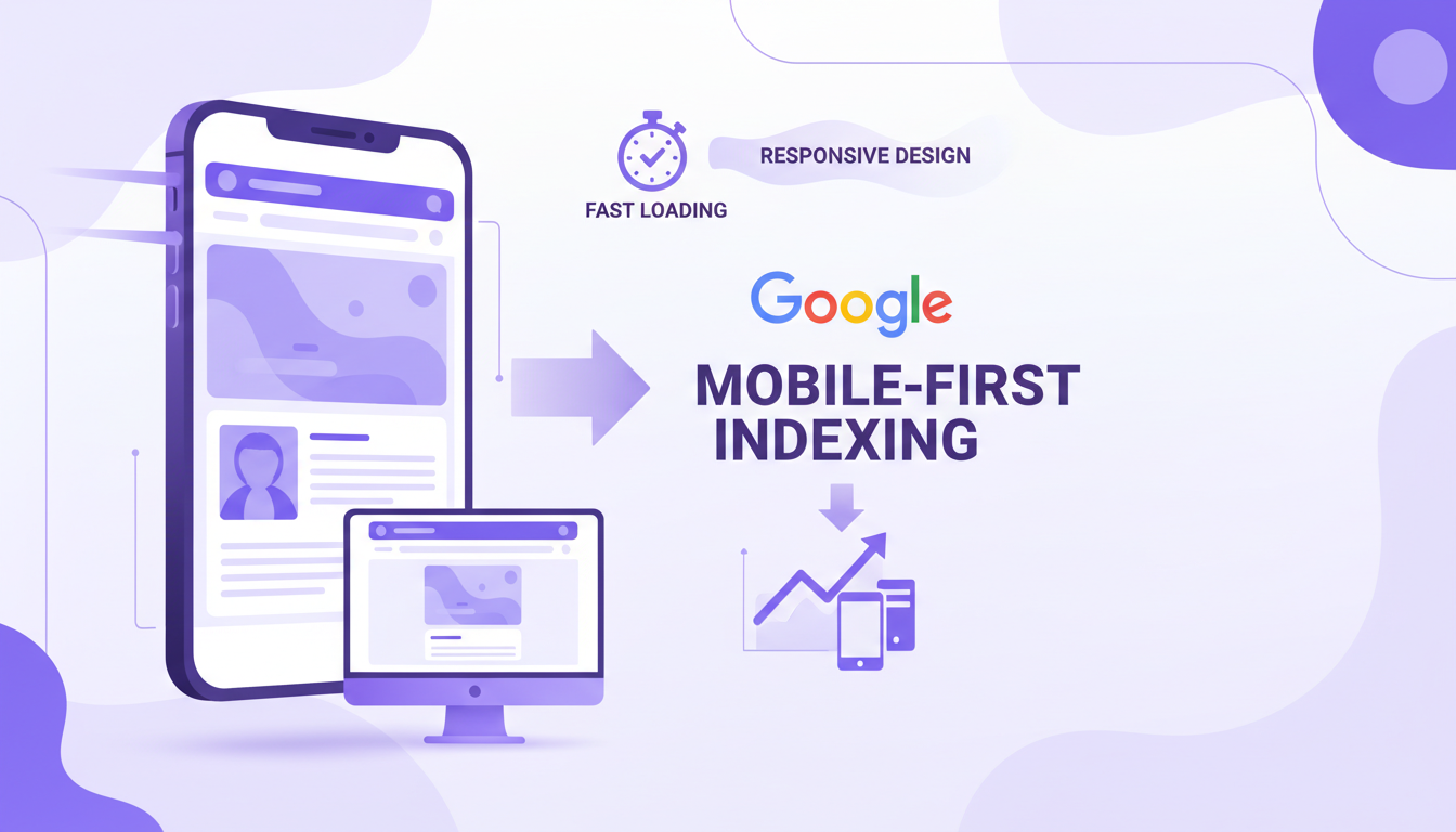
Google's shift to mobile-first indexing is no longer a future consideration — it is the present reality. Since completing its migration in late 2023, Google now uses the mobile version of every website as the primary basis for crawling, indexing, and ranking. For UK businesses, this means that if your site delivers a poor mobile experience, your search visibility will suffer regardless of how polished your desktop version looks. This comprehensive guide covers everything you need to know about optimising for mobile-first indexing and securing your organic search performance.
What Mobile-First Indexing Actually Means
Mobile-first indexing is often misunderstood. It does not mean that Google has a separate mobile index or that desktop sites are invisible. Rather, it means Google's crawlers — the bots that visit and catalogue your website — now simulate a mobile device rather than a desktop browser when they evaluate your pages. The content, structured data, metadata, and links that Google sees on your mobile version are what determine your rankings for both mobile and desktop search results.
This distinction matters enormously. If your mobile site is a stripped-down version of your desktop site — with fewer pages, less content, or missing structured data — then Google is making ranking decisions based on an incomplete picture of your business. Conversely, if your mobile experience is fast, comprehensive, and well-structured, you're giving Google's algorithms every reason to rank you favourably.
The UK Mobile Landscape in Numbers
Understanding the scale of mobile usage in the UK helps frame why this matters so urgently. According to Ofcom's latest Communications Market Report, 95% of UK adults own a smartphone, and mobile devices account for approximately 63% of all web traffic nationwide. In certain sectors — hospitality, local services, retail — mobile traffic exceeds 75%.
The behavioural patterns are equally telling. UK consumers increasingly expect to complete entire transactions on their phones, from initial research through to purchase or enquiry. A 2024 study by the Internet Advertising Bureau UK found that 68% of consumers who had a negative mobile experience with a brand were less likely to engage with that brand in future — across any channel, not just mobile. The damage from a poor mobile experience extends well beyond lost clicks.
For local businesses, the implications are even more pronounced. Google reports that "near me" searches on mobile have grown by over 500% in the past five years, and 76% of people who search for something nearby on their phone visit a related business within a day. If your site isn't optimised for mobile, you're invisible to these high-intent, ready-to-buy searchers.
Core Web Vitals: The Technical Foundation
Google's Core Web Vitals are the measurable performance metrics that directly influence your mobile search rankings. They assess the real-world experience users have when loading and interacting with your pages. Understanding and optimising these metrics is non-negotiable for mobile SEO success.
Largest Contentful Paint (LCP)
LCP measures how quickly the largest visible content element — typically a hero image, featured video, or large text block — renders on screen. Google considers an LCP of under 2.5 seconds to be "good." For UK sites, the median LCP on mobile is approximately 3.8 seconds, meaning most businesses have significant room for improvement. Common causes of poor LCP include unoptimised images, slow server response times, render-blocking JavaScript, and large CSS files.
Interaction to Next Paint (INP)
INP replaced First Input Delay (FID) as a Core Web Vital in March 2024. It measures the responsiveness of your page throughout the entire user visit — not just the first interaction. An INP under 200 milliseconds is considered good. Heavy JavaScript execution, third-party scripts (chat widgets, analytics, advertising tags), and unoptimised event handlers are the most common culprits behind poor INP scores.
Cumulative Layout Shift (CLS)
CLS measures visual stability — how much content shifts around unexpectedly as the page loads. You've experienced bad CLS if you've ever tried to tap a button on your phone only to have the page jump and send you somewhere unintended. A CLS score below 0.1 is the target. Images without explicit dimensions, dynamically injected content, and web fonts that cause text reflow are the primary causes of layout shift on mobile.
Use Google's PageSpeed Insights with your actual URL — not just the homepage — to assess Core Web Vitals. Your product pages, service pages, and blog posts may perform very differently from your homepage. Test your five highest-traffic pages individually and prioritise the worst performers, as these have the greatest impact on your overall search visibility.
Responsive Design: Getting the Fundamentals Right
Responsive web design — where a single codebase adapts fluidly to different screen sizes — is the approach Google explicitly recommends for mobile-first indexing. It's also the most practical approach for the vast majority of UK businesses. The alternatives — serving separate mobile URLs (m.example.co.uk) or using dynamic serving — introduce complexity and potential issues that responsive design avoids entirely.
Essential Responsive Design Principles
- Fluid grid layouts: Use relative units (percentages, viewport units, flexbox, CSS Grid) rather than fixed pixel widths. This allows content to reflow naturally across screen sizes without horizontal scrolling.
- Flexible images: Set images to
max-width: 100%and use thesrcsetattribute to serve appropriately sized images for each device. A 2400-pixel-wide hero image that looks stunning on a 27-inch monitor is wasteful and slow on a 6-inch phone screen. - CSS media queries: Define breakpoints where your layout adapts. Common breakpoints target devices at 480px, 768px, 1024px, and 1280px, though your specific content should dictate where adjustments are needed.
- Touch-friendly interactions: Buttons and links should be at least 48x48 pixels with adequate spacing between them. This prevents the frustrating experience of tapping the wrong element — a problem that drives mobile users away from your site.
- Readable typography: Body text should be at least 16px on mobile. Line heights should be generous (1.5 to 1.8), and paragraphs should be kept to manageable lengths. Reading on a small screen demands more whitespace, not less.
The Viewport Meta Tag
This single line of HTML is surprisingly often missing or incorrectly configured: <meta name="viewport" content="width=device-width, initial-scale=1">. Without it, mobile browsers will attempt to render your page at a desktop width and then scale it down, resulting in tiny, unreadable text and a terrible user experience. It's the most basic mobile optimisation requirement, yet Google Search Console regularly flags it as an issue for UK websites.
Mobile Page Speed Optimisation
Speed is the single most impactful factor in mobile SEO. Mobile users are on variable connections — 4G, 5G, congested public Wi-Fi — and their tolerance for waiting is measured in seconds, not minutes. The data is unambiguous: as page load time increases from one second to three seconds, the probability of a bounce increases by 32%. From one to five seconds, it increases by 90%.
Image Optimisation
Images typically account for 50-70% of a mobile page's total weight. Optimising them is usually the single biggest performance win available:
- Use modern formats: WebP and AVIF offer 25-50% smaller file sizes than JPEG and PNG at equivalent quality. All modern mobile browsers support WebP, and AVIF support is growing rapidly.
- Implement lazy loading: Add
loading="lazy"to images below the fold. This defers loading until the user scrolls near them, dramatically reducing initial page weight. - Serve responsive images: Use the
srcsetattribute to provide multiple image sizes and let the browser select the most appropriate one. A 300px-wide image is sufficient for most mobile screens — don't force phones to download desktop-sized assets. - Compress aggressively: Most images can be compressed to 60-80% quality without perceptible visual degradation. Tools like Sharp, Squoosh, or automated CDN-based compression handle this efficiently.
JavaScript Management
Excessive JavaScript is the most common cause of poor mobile performance on UK websites. Every kilobyte of JavaScript must be downloaded, parsed, compiled, and executed — and mobile processors handle this significantly slower than desktop CPUs. Audit your JavaScript ruthlessly:
- Remove unused JavaScript (Google Lighthouse identifies this precisely)
- Defer non-critical scripts using
asyncordeferattributes - Split large bundles into smaller, route-specific chunks
- Evaluate whether every third-party script genuinely justifies its performance cost
- Consider replacing heavy frameworks with lighter alternatives for content-focused sites
Third-party scripts — analytics, chat widgets, social media embeds, advertising pixels, A/B testing tools — are the silent killers of mobile performance. Each one adds HTTP requests, JavaScript execution time, and often layout shifts. Audit your third-party scripts quarterly and remove any that aren't delivering measurable value. A single poorly-coded chat widget can add two or more seconds to your page load time.
| Image Format | File Size vs JPEG | UK Browser Support | Best Use Case |
|---|---|---|---|
| JPEG | Baseline | Universal — all browsers | Photographs and complex images |
| PNG | 2–3x larger | Universal — all browsers | Graphics requiring transparency |
| WebP | 25–35% smaller | 97% — all modern browsers | General-purpose web images |
| AVIF | 40–50% smaller | 92% — growing rapidly | High-quality photography |
| SVG | Minimal — vector based | Universal — all browsers | Icons, logos, and illustrations |
Mobile Content Strategy
Mobile-first indexing demands that your mobile content be at least as comprehensive as your desktop content. In the past, some businesses deliberately served slimmed-down content to mobile users, hiding paragraphs, removing FAQs, or collapsing sections. Under mobile-first indexing, any content that doesn't appear on mobile effectively doesn't exist for ranking purposes.
Content Parity
Ensure that all text content, images (with alt attributes), videos, structured data, and internal links present on your desktop pages are also accessible on mobile. Content hidden behind "Read More" toggles or accordion elements is generally still indexed by Google, provided it's present in the HTML and accessible without JavaScript. However, content that requires user interaction to become visible may receive slightly less weight than content that's immediately visible.
Mobile-Optimised Content Formatting
Even with content parity, how content is presented on mobile matters enormously for both user experience and engagement signals that influence rankings:
- Front-load key information: Mobile users scan rather than read. Place the most important points at the beginning of paragraphs and sections.
- Use descriptive subheadings: Break content into scannable sections with H2 and H3 headings that tell users exactly what each section covers.
- Keep paragraphs concise: Three to four sentences maximum. Wall-of-text formatting that's tolerable on desktop becomes impenetrable on a mobile screen.
- Use bulleted and numbered lists: Lists are easier to scan on small screens and help users find specific information quickly.
- Include jump links: For longer content, add a table of contents with anchor links at the top so mobile users can navigate directly to relevant sections.
Before and After: Mobile SEO Optimisation Impact
The difference between a site that has been properly optimised for mobile-first indexing and one that hasn't can be measured in both rankings and revenue. Here's what the transformation typically looks like for UK businesses:
Before Mobile Optimisation
After Cloudswitched Mobile SEO
Technical SEO for Mobile-First Indexing
Beyond performance and content, several technical SEO elements require specific attention under mobile-first indexing.
Structured Data
Ensure all structured data (Schema.org markup) present on your desktop site is also present on your mobile version. This includes organisation schema, local business schema, product schema, FAQ schema, review schema, and breadcrumb schema. If you're using responsive design, this is handled automatically — the same HTML serves both versions. But if you're using any form of separate mobile serving, verify that structured data isn't being stripped from the mobile version.
Internal Linking
Your mobile site's internal link structure must be as comprehensive as desktop. Some sites inadvertently reduce internal linking on mobile by collapsing navigation menus, removing sidebar links, or hiding footer navigation. These missing links reduce the ability of Google's crawlers to discover and understand your site's full content architecture.
Mobile-Specific Meta Tags
Meta titles and descriptions should be optimised for mobile display. Google typically shows 50-60 characters for title tags and 120 characters for meta descriptions on mobile — shorter than desktop limits. Front-load keywords and compelling language to ensure your most important messaging appears before the truncation point.
XML Sitemaps and Robots.txt
Your XML sitemap should reference the canonical URLs of your pages. If you use responsive design (recommended), these are simply your standard URLs. Ensure your robots.txt file doesn't inadvertently block Googlebot from accessing CSS, JavaScript, or image resources needed to render your mobile pages — Google needs access to these files to evaluate your mobile experience accurately.
Mobile UX Signals That Affect Rankings
Google uses various engagement signals to assess page quality, and these signals are increasingly measured from the mobile experience. Whilst Google has never confirmed the exact engagement metrics it uses as ranking factors, the correlation between strong mobile UX and better rankings is well documented.
Key mobile UX factors include dwell time (how long users stay on your page), pogo-sticking (when users return to search results quickly after clicking your listing), scroll depth, and interaction rates. All of these are strongly influenced by mobile usability. A page that loads quickly, presents content clearly, and makes it easy to take the next action will naturally generate positive engagement signals.
Avoiding Mobile Interstitials
Google has explicitly penalised intrusive mobile interstitials — those full-screen pop-ups that obscure content immediately after a user arrives from search. Cookie consent banners required by UK law (ICO compliance) are exempt from this penalty, but marketing pop-ups, email subscription overlays, and promotional interstitials should be implemented with extreme care on mobile. Use non-intrusive banners or delay pop-ups until the user has engaged with your content.
Testing and Monitoring Your Mobile SEO
Mobile SEO optimisation is not a one-time project — it requires ongoing monitoring and iterative improvement. The tools and processes you need are largely free and accessible:
- Google Search Console: The Mobile Usability report identifies specific pages with mobile issues. The Core Web Vitals report shows field data from real users. The URL Inspection tool shows you exactly how Googlebot renders your mobile pages.
- Google PageSpeed Insights: Provides both lab data (simulated) and field data (from real Chrome users) for any URL. Test key pages regularly and track improvements over time.
- Chrome DevTools device emulation: Open DevTools, click the device toggle, and test your site across different mobile screen sizes. This catches layout issues, touch target problems, and content visibility issues quickly.
- Real device testing: No emulator perfectly replicates real-world mobile performance. Test on actual devices — at minimum an iPhone and an Android device — on both Wi-Fi and mobile data connections.
- Web Vitals Chrome extension: Provides real-time Core Web Vitals measurements as you browse your own site, making it easy to spot issues during development and content updates.
Google Search Console now provides separate performance reports for mobile and desktop. Comparing these side by side often reveals surprising disparities — pages that rank well on desktop but poorly on mobile indicate mobile-specific issues that need addressing. Check this comparison monthly as part of your SEO review process.
Local Mobile SEO for UK Businesses
For businesses serving specific geographic areas — whether that's a single town, a county, or the whole of the UK — mobile and local SEO are deeply intertwined. The majority of local searches happen on mobile, and Google's local pack results (the map and three business listings) are even more prominent on mobile screens than desktop.
Optimising for Local Mobile Search
- Google Business Profile: Ensure your profile is complete, accurate, and regularly updated with posts, photos, and responses to reviews. This is often the first thing mobile searchers see.
- NAP consistency: Your Name, Address, and Phone number must be identical across your website, Google Business Profile, and all directory listings. Inconsistencies confuse both Google and potential customers.
- Location pages: If you serve multiple areas, create dedicated, content-rich pages for each. Include local landmarks, travel directions, area-specific services, and embedded Google Maps.
- Click-to-call functionality: Make phone numbers tappable links using
tel:protocol. For many UK service businesses, phone calls from mobile search are the primary conversion path. - Local structured data: Implement LocalBusiness schema with accurate opening hours, service areas, and accepted payment methods. This enriches your mobile search listings with useful information that drives clicks.
Future-Proofing Your Mobile SEO Strategy
The mobile web continues to evolve rapidly. Staying ahead of emerging trends ensures your SEO investment remains protected:
Progressive Web Apps (PWAs): PWAs combine the reach of websites with app-like features — offline access, push notifications, home screen installation. They're fully compatible with mobile-first indexing and can significantly improve engagement metrics. Several major UK retailers and publishers have seen conversion rate improvements of 50% or more after implementing PWAs.
Voice search optimisation: With smart speakers in over 40% of UK households and voice assistants on every smartphone, optimising for voice queries is increasingly important. Voice searches tend to be longer, more conversational, and more locally focused. Structuring content to answer specific questions directly — and marking it up with FAQ schema — positions you well for this growing channel.
AI-powered search: Google's Search Generative Experience (SGE) and AI Overviews are changing how search results appear, particularly on mobile where screen space is limited. Content that provides clear, authoritative, well-structured answers to specific questions is most likely to be surfaced in these AI-generated summaries.
Is Your Website Ready for Mobile-First Indexing?
Our SEO specialists conduct comprehensive mobile audits that identify every issue holding back your search performance. From Core Web Vitals optimisation to content strategy and technical fixes, we help UK businesses dominate mobile search results. Book your free mobile SEO assessment today.
TALK TO AN EXPERTTaking Action on Mobile SEO
Mobile-first indexing is not a trend to monitor from the sidelines — it's the reality of how your website is being evaluated right now. Every day that your mobile experience underperforms is a day that Google is judging your entire site based on that suboptimal version. The good news is that the path to mobile SEO excellence is well understood and achievable for businesses of any size.
Start with the fundamentals: verify responsive design works correctly, measure your Core Web Vitals, and ensure content parity between mobile and desktop. Then move to optimisation: compress images, reduce JavaScript, improve touch targets, and refine your mobile content formatting. Finally, build ongoing monitoring into your processes so that improvements are sustained and new issues are caught before they impact rankings.
The UK businesses that thrive in organic search over the coming years will be those that treat mobile not as a secondary consideration but as the primary platform through which their customers discover and engage with them. Your mobile experience is your SEO — optimise accordingly.

CloudSwitched
London-based managed IT services provider offering support, cloud solutions and cybersecurity for SMEs.


