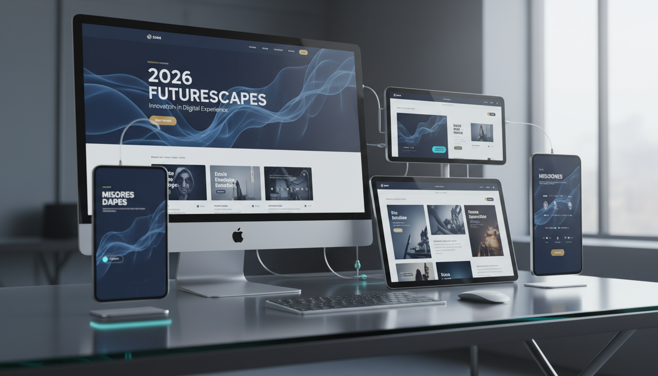
The web design landscape evolves continuously, but not every trend deserves your attention or your budget. For UK businesses investing in a new website or redesigning an existing one, the challenge is separating genuine, conversion-driving design improvements from fleeting aesthetic fads that look impressive in design agency portfolios but fail to deliver measurable business results.
As we look ahead to 2026, several design trends are emerging that have real substance behind them — trends backed by user behaviour research, accessibility standards, performance data, and conversion rate evidence. These are not trends for trend's sake; they are practical design approaches that help UK businesses communicate more effectively, convert more visitors, and deliver better experiences across all devices and connection speeds.
This guide examines the web design trends that matter for UK businesses in 2026, explains why each one works, and provides practical guidance on implementation. We focus on trends that improve business outcomes — lead generation, customer engagement, brand perception, and operational efficiency — rather than trends that merely look interesting on a designer's Dribbble page.
Trend 1: Performance-First Design
The most important web design trend for 2026 is not visual at all — it is performance. Google's Core Web Vitals have been a ranking factor since 2021, but their importance continues to grow. More significantly, the evidence connecting page speed to conversion rates is now overwhelming. Research from Deloitte found that a 0.1-second improvement in page load time increased conversion rates by 8% for retail sites and 10% for travel sites. For UK businesses, where the average e-commerce conversion rate hovers around 4%, an improvement of this magnitude translates directly into revenue.
Performance-first design means making speed a primary design constraint rather than an afterthought. Every visual element — images, animations, fonts, scripts — must justify its performance cost against its contribution to user experience and conversion. This does not mean creating plain, boring websites; it means being intentional about where you invest your performance budget and eliminating waste.
In practical terms, performance-first design involves using modern image formats (WebP and AVIF) with responsive sizing, minimising render-blocking CSS and JavaScript, implementing lazy loading for below-the-fold content, using system fonts or variable fonts instead of loading multiple font files, and leveraging browser caching and content delivery networks. The target should be a Largest Contentful Paint under 2.5 seconds, a First Input Delay under 100 milliseconds, and a Cumulative Layout Shift under 0.1.
Measuring and Optimising Core Web Vitals
Measuring performance effectively requires more than a single PageSpeed Insights test. UK businesses should establish a continuous monitoring process using tools such as Google Search Console, which reports field data from real users across different devices and connection speeds. Field data is particularly important because it reflects how your actual audience experiences your site, not how it performs on a developer's high-spec machine connected to fibre broadband. Many UK users, particularly in rural areas, still rely on slower connections, and your website needs to perform acceptably for them as well.
A practical approach to Core Web Vitals optimisation is to audit your existing pages and rank them by traffic volume, then focus improvement efforts on the highest-traffic pages first. Common quick wins include compressing and resizing hero images, deferring non-critical JavaScript, and removing unused CSS. For more complex issues, consider implementing a content delivery network to reduce server response times for users across the United Kingdom, and use resource hints such as preconnect and preload to accelerate the loading of critical assets. Regularly reviewing your Vitals data each month ensures that new content and design changes do not inadvertently degrade the performance gains you have already achieved.
Trend 2: Accessibility as Standard, Not Add-On
Web accessibility has shifted from a nice-to-have consideration to a legal and commercial imperative. The Equality Act 2010 requires UK businesses to make reasonable adjustments to ensure their services are accessible to disabled people, and case law is increasingly establishing that websites fall within this requirement. Beyond legal compliance, the business case for accessibility is compelling: approximately 16 million people in the United Kingdom have a disability, representing enormous market potential that inaccessible websites simply cannot reach.
In 2026, the trend is towards designing for accessibility from the outset rather than retrofitting it after launch. This means building with semantic HTML, ensuring sufficient colour contrast ratios (minimum 4.5:1 for normal text), providing text alternatives for images, ensuring keyboard navigation works throughout the site, using ARIA labels where appropriate, and testing with screen readers and other assistive technologies.
The Web Content Accessibility Guidelines (WCAG) 2.2, published in late 2023, introduced new success criteria around focus appearance, dragging movements, and target size that web designers need to incorporate. Aiming for WCAG 2.2 AA compliance is the recommended standard for UK businesses — it satisfies legal requirements, covers the vast majority of accessibility needs, and is achievable without compromising visual design quality.
Practical Steps for Accessibility Integration
Integrating accessibility into the design process begins at the wireframing stage. When designers think about page structure, information hierarchy, and user flows before visual polish is applied, accessibility considerations become part of the design rather than a remediation task. Wireframes should clearly define the heading hierarchy, identify where ARIA landmarks will be placed, and map out the logical tab order for keyboard navigation. Colour palette selection should be guided by contrast ratio testing from the outset, using tools such as the WebAIM Contrast Checker or Stark plugin for design applications. This prevents the costly scenario of discovering, after a design has been approved and coded, that the brand colours do not meet WCAG contrast requirements.
Equally important is building accessibility into your development workflow. Code reviews should include accessibility checks just as routinely as they include security reviews. Automated testing tools like axe-core can be integrated into continuous integration pipelines so that accessibility regressions are caught before they reach production. Training your development team on semantic HTML, ARIA patterns, and assistive technology behaviour is one of the highest-return investments a UK business can make in its web presence, because it prevents accessibility issues from being introduced in the first place rather than requiring expensive remediation after launch.
The Purple Pound — the spending power of disabled consumers in the UK — is estimated at £274 billion annually. Research by the Click-Away Pound project found that 71% of disabled customers will leave a website that they find difficult to use, taking their spending elsewhere. For UK businesses, investing in accessibility is not charity — it is sound commercial strategy that expands your addressable market by millions of potential customers.
Trend 3: Structured Content and Scannable Layouts
User behaviour research consistently shows that web visitors do not read — they scan. Eye-tracking studies demonstrate that users typically scan pages in an F-pattern, reading the first few lines across the full width before scanning down the left side, picking out headings, bullet points, and bold text. The most effective web designs for 2026 work with this behaviour rather than against it.
Structured content design means breaking information into clearly delineated sections with descriptive headings, using bullet points and numbered lists for scannable information, employing visual hierarchy through size, weight, and colour to guide the eye, providing summary statements at the top of long content, and using whitespace generously to prevent cognitive overload.
For UK business websites, this translates into shorter paragraphs (3-4 sentences maximum), descriptive subheadings every 200-300 words, strategic use of callout boxes and pull quotes, accordion components for FAQ sections and detailed specifications, and clear, prominent calls to action positioned at natural decision points in the content flow.
Content Architecture for Conversion
Content architecture goes beyond simple formatting choices. It encompasses the overall information structure of each page and how that structure guides visitors towards meaningful actions. For UK business websites, this means understanding the specific questions your target audience is trying to answer and structuring your content to address those questions in a logical sequence. A well-architected page anticipates the visitor's thought process: it opens with a clear value proposition, addresses likely objections, provides supporting evidence, and concludes with a straightforward path to the next step. Each section should have a single clear purpose, and the transition from one section to the next should feel natural and inevitable.
One particularly effective pattern for UK service businesses is the problem-agitation-solution framework adapted for web content. The opening section identifies the challenge the visitor is facing, the middle sections demonstrate expertise by exploring the problem in depth and presenting the solution clearly, and the closing section makes it easy to take action. This structure works because it mirrors the decision-making process of a typical B2B buyer: they arrive with a problem, they want to understand it better, they evaluate potential solutions, and then they commit to a conversation. By aligning your content architecture with this natural flow, you reduce friction at every stage and increase the likelihood that visitors will convert into leads or customers.
Effective Content Structure
- Descriptive headings every 200-300 words
- Short paragraphs of 3-4 sentences
- Bullet points for lists and features
- Visual callouts for key information
- Clear CTAs at decision points
- Progressive disclosure for complex content
- Summary at the top of long pages
Ineffective Content Structure
- Long, unbroken blocks of text
- Generic headings that do not describe content
- Dense paragraphs of 8+ sentences
- No visual differentiation between sections
- CTAs hidden at the bottom of the page only
- All information presented at once
- No way to quickly find specific information
Trend 4: Authentic Visual Identity Over Stock Photography
The era of generic stock photography on business websites is ending. UK consumers have become adept at recognising stock imagery, and its presence on a business website increasingly signals inauthenticity and lack of investment. In 2026, the trend is firmly towards authentic visual identity — custom photography, genuine team images, original illustrations, and brand-specific visual elements that communicate who you actually are rather than who a stock photo agency imagines you might be.
This does not mean every business needs a £10,000 photography budget. Modern smartphone cameras produce excellent quality images, and a skilled photographer can create a comprehensive library of team, office, and process images in a single half-day shoot. The investment in authentic imagery pays for itself through improved trust signals, better brand differentiation, and higher conversion rates. Studies consistently show that pages with authentic images outperform those with stock photography by 35% or more on engagement metrics.
Building a Visual Asset Library
Creating a comprehensive visual asset library does not need to be an overwhelming undertaking. Start by identifying the categories of imagery your website needs: team portraits, workspace environments, process shots showing your team at work, product or service imagery, and location-specific photographs if geography matters to your customers. Plan a single photography session that covers all these categories, preparing shot lists in advance so the photographer can work efficiently. Brief your team on appropriate attire and be clear about the style you are aiming for — candid and natural tends to resonate far better than stiff, overly posed corporate photography. Many UK businesses find that quarterly photo sessions of two to three hours are sufficient to keep their image library fresh and relevant throughout the year.
Beyond photography, consider developing a custom illustration style that extends your brand identity into areas where photography is impractical. Custom icons, diagrams, and illustrations can communicate complex concepts more effectively than photographs, and they provide visual consistency across your entire digital presence. A set of custom icons designed specifically for your service offerings, for instance, reinforces brand recognition and makes your website instantly distinguishable from competitors using generic stock icon sets. When combined with authentic photography, a distinctive illustration style creates a visual identity that is genuinely yours and impossible for competitors to replicate.
Trend 5: Intelligent Form Design and Conversion Optimisation
For UK businesses that rely on their website for lead generation, form design has a disproportionate impact on conversion rates. The trend in 2026 is towards intelligent, contextual forms that adapt to user behaviour and minimise friction.
Multi-step forms — where information is collected across several short steps rather than in a single long form — consistently outperform traditional forms, with conversion rate improvements of 20-40% reported across multiple studies. Each step should contain no more than 3-4 fields, with clear progress indication and the ability to go back and edit previous steps. The first step should ask for the least sensitive information (service interest, company size) to build commitment before asking for contact details.
Conditional logic enables forms to show or hide fields based on previous answers, ensuring users only see relevant questions. Inline validation provides immediate feedback on field completion, reducing errors and abandonment. Autofill support leverages browser-stored information to reduce typing. Together, these techniques create a form experience that feels effortless rather than burdensome.
Reducing Form Abandonment
Form abandonment is one of the most significant conversion leaks on UK business websites, and understanding why users abandon forms is the first step to reducing it. Research consistently identifies several primary causes: forms that are too long, unclear labelling that creates confusion about what information is being requested, lack of trust signals near the form, and the absence of feedback when errors occur. Addressing each of these causes requires a thoughtful approach. For length, audit every field and ask whether it is genuinely necessary at this stage of the customer relationship — information that can be gathered later in a sales conversation should not be a barrier to initial contact. For labelling, use plain language that matches how your audience thinks and speaks, avoiding internal jargon or ambiguous field names.
Trust signals play a crucial role in form completion rates, particularly for forms that request sensitive information. Positioning testimonials, security badges, privacy assurances, and data handling statements in close proximity to the form can significantly reduce hesitation. For UK businesses, explicitly stating how the submitted data will be used and referencing your GDPR compliance demonstrates respect for the user's privacy and builds confidence. Additionally, implementing save-and-resume functionality for longer forms ensures that users who are interrupted do not lose their progress, removing a significant source of frustration and abandonment. Even simple progress indicators showing how many steps remain can reduce perceived effort and encourage completion.
Trend 6: Dark Mode and Colour Scheme Preferences
Dark mode support has moved from a novelty to an expectation. Operating system-level dark mode settings are now used by approximately 82% of smartphone users, and websites that respect these preferences through the prefers-color-scheme CSS media query deliver a noticeably better experience. For 2026, offering both light and dark modes — with automatic detection of user preference and a manual toggle — is becoming standard practice for business websites.
Beyond dark mode, there is a broader trend towards respectful colour design that accounts for user preferences, environmental conditions, and accessibility requirements. This includes using CSS custom properties (variables) for consistent theming, ensuring all colour combinations meet WCAG contrast requirements in both modes, and testing designs across different display types and brightness settings.
Implementing Theme Switching
Implementing theme switching effectively requires more than simply inverting your colour palette. A well-executed dark mode needs its own carefully considered colour system. Dark backgrounds should not be pure black — a very dark grey is easier on the eyes and provides better perceived contrast with text. Text colours in dark mode should be slightly off-white rather than pure white to reduce glare. Accent colours often need adjustment in dark mode because a colour that looks vibrant on a white background may appear either washed out or overwhelming on a dark surface. Shadows behave differently against dark backgrounds as well, so elevation in dark mode is typically communicated through lighter surface colours rather than drop shadows.
From a technical implementation perspective, CSS custom properties make theme switching straightforward to maintain. Define your entire colour system as custom properties on the root element, then override those properties within a dark mode class or media query. This approach ensures that every element on the page responds to theme changes consistently, without requiring individual dark-mode rules scattered throughout your stylesheet. Store the user's theme preference in localStorage so it persists across visits, and apply the saved preference before the page renders to prevent a flash of the wrong theme on page load. Testing both themes thoroughly is essential — it is common to discover that certain UI elements, particularly those using images or complex backgrounds, look excellent in one theme but are barely visible or aesthetically jarring in the other.
Trend 7: Micro-Interactions and Purposeful Animation
Animation in web design has matured significantly. The gratuitous parallax scrolling and attention-seeking motion effects of the 2010s have given way to subtle, purposeful micro-interactions that provide feedback, guide attention, and enhance usability. In 2026, the best animations are the ones users barely notice consciously but would miss if they were removed.
Effective micro-interactions include button state changes that confirm clickability and action completion, smooth scroll behaviour between page sections, loading state indicators that reduce perceived wait times, form field animations that confirm valid input, and navigation transitions that provide spatial context. Each animation should serve a clear purpose — communicating state, providing feedback, or guiding attention — and should respect the prefers-reduced-motion media query for users who experience motion sensitivity.
Animation Performance Considerations
While purposeful animation enhances the user experience, poorly implemented animation can actively harm it. The most common performance issue with web animations is triggering layout recalculations and repaints. Animating properties such as width, height, margin, or top forces the browser to recalculate the layout of surrounding elements on every frame, which can cause visible jank and dropped frames, particularly on lower-powered devices. Instead, limit animations to the transform and opacity properties, which the browser can handle on the GPU compositing layer without triggering layout recalculations. A button hover effect that scales using a CSS transform is dramatically more performant than one that adjusts width and height, even though the visual result may appear similar.
The prefers-reduced-motion media query deserves particular attention in 2026. Approximately 35% of adults experience some form of motion sensitivity, ranging from mild discomfort to vestibular disorders that can cause nausea, dizziness, and disorientation. When a user has enabled the reduced motion preference in their operating system settings, your website should respect that choice by disabling decorative animations, replacing sliding transitions with instant state changes, and stopping any auto-playing motion. This is not merely a considerate design choice — it is an accessibility requirement under WCAG 2.1 criterion 2.3.3. Implementing this properly requires wrapping your animation CSS within a media query that checks for the user's preference, ensuring that the fallback experience is still fully functional and visually coherent without the motion effects.
| Design Trend | Business Impact | Implementation Effort | Priority for 2026 |
|---|---|---|---|
| Performance optimisation | Higher conversion rates, better SEO | Medium | Essential |
| Accessibility compliance | Expanded market, legal compliance | Medium | Essential |
| Structured content layouts | Better engagement, lower bounce rates | Low | High |
| Authentic visual identity | Trust, differentiation, conversions | Medium | High |
| Intelligent form design | Higher lead conversion rates | Medium | High |
| Dark mode support | User satisfaction, modern perception | Low-Medium | Medium |
| Purposeful micro-interactions | Perceived quality, usability feedback | Low | Medium |
Ready for a Website That Drives Results?
Cloudswitched builds high-performance, accessible websites for UK businesses that look outstanding and convert visitors into customers. Our web development team combines technical excellence with strategic design thinking to create websites that are fast, accessible, visually distinctive, and optimised for lead generation. Whether you need a complete redesign or targeted improvements to your existing site, we deliver measurable results. Get in touch to discuss your website project.
Explore Our Web Development Services
CloudSwitched
London-based managed IT services provider offering support, cloud solutions and cybersecurity for SMEs.


