A well-built sales reporting dashboard is the command centre of any high-performing UK sales operation. It transforms scattered CRM records, pipeline data, and transaction histories into a single, visual interface that sales managers and directors can use to make faster, better-informed decisions. Yet despite the clear benefits, many UK businesses still rely on weekly spreadsheet reports emailed around the team — a process that is slow, inconsistent, and fundamentally reactive rather than proactive.
The difference between organisations that consistently hit their revenue targets and those that perpetually miss them often comes down to visibility. When your sales team can see pipeline health, conversion rates, and forecast accuracy in real time, they can identify problems early and take corrective action before opportunities are lost. A dashboard does not replace good salesmanship — but it gives good salespeople the information they need to focus their effort where it matters most.
This guide covers every aspect of building an effective sales reporting dashboard for UK businesses — from selecting the right metrics and designing intuitive layouts through to CRM integration, forecasting models, and the practical considerations of dashboard deployment across your sales organisation. Whether you are building from scratch or improving an existing reporting setup, the principles here will help you create a dashboard that genuinely drives sales performance.
The landscape of sales reporting in the United Kingdom has shifted dramatically over the past five years. The rise of cloud-based CRM platforms, affordable data warehousing, and powerful visualisation tools has made custom dashboards accessible to businesses of every size — not just enterprise corporations with dedicated business intelligence teams. Mid-market firms and growing SMEs across sectors from SaaS and financial services to manufacturing and professional services are now building dashboards that were once the exclusive domain of FTSE 250 companies. This democratisation of data means the competitive advantage no longer lies in having a dashboard at all, but in having one that is thoughtfully designed, deeply integrated, and genuinely aligned with your sales process.
Defining Your Key Sales Metrics
The most common mistake in dashboard design is including too many metrics. A dashboard cluttered with every conceivable data point is no better than raw data — it overwhelms users and obscures the signals that actually matter. The best sales dashboards focus on a carefully curated set of metrics that align directly with your sales strategy and organisational objectives.
Revenue Metrics
Revenue is the ultimate measure of sales success, but raw revenue figures alone tell an incomplete story. Your dashboard should present revenue alongside context that makes it actionable: revenue versus target (both absolute and percentage), revenue by product or service line, revenue by customer segment, and revenue trend over time. For UK businesses with seasonal patterns — retailers peaking at Christmas, B2B firms seeing budget-driven Q4 surges, tourism businesses following holiday calendars — trend visualisation is essential for distinguishing genuine performance changes from seasonal effects.
For UK subscription and SaaS businesses, recurring revenue metrics deserve particular attention on your dashboard. Monthly Recurring Revenue (MRR), Annual Recurring Revenue (ARR), churn rate, and net revenue retention are essential for understanding the health and trajectory of a subscription-based business model. Displaying these alongside traditional revenue metrics gives sales leaders a complete picture — new business acquisition performance viewed in the context of retention and expansion revenue. Many UK SaaS companies find that once they separate new business revenue from expansion and renewal revenue on their dashboards, coaching conversations become far more targeted and effective.
Pipeline Metrics
Pipeline health metrics provide forward-looking visibility that revenue figures alone cannot deliver. Key pipeline metrics include total pipeline value (weighted and unweighted), pipeline coverage ratio (pipeline value divided by remaining target), pipeline velocity (how quickly deals move through stages), and stage conversion rates. For UK B2B businesses where sales cycles commonly span three to nine months, pipeline metrics are the earliest indicators of future revenue performance.
Industry benchmarks suggest that UK B2B sales teams should maintain a pipeline coverage ratio of 3x to 4x their remaining quarterly target. Below 3x, there is insufficient pipeline to absorb normal attrition and still hit target. Above 5x may indicate deals are stalling in the pipeline rather than progressing. Your dashboard should display coverage ratio prominently, with clear colour coding — green above 3x, amber between 2x and 3x, red below 2x — to provide instant visual assessment of pipeline sufficiency.
Activity Metrics
Activity metrics track the leading indicators that drive pipeline and revenue: calls made, emails sent, meetings booked, proposals delivered, and demos completed. While activity volume alone does not guarantee results, a sudden drop in activity often precedes a pipeline decline by several weeks. Your dashboard should present activity metrics at both team and individual levels, enabling managers to identify coaching opportunities and resource allocation needs before they impact revenue outcomes.
Customer Acquisition Cost and Efficiency
Beyond raw activity and pipeline metrics, your dashboard should track the cost and efficiency of your sales operation. Customer Acquisition Cost (CAC), calculated by dividing total sales and marketing spend by the number of new customers acquired, provides a crucial lens on whether your growth is sustainable. Pair this with Customer Lifetime Value (LTV) to produce the LTV:CAC ratio — a metric that investors, board members, and finance directors increasingly expect to see. UK businesses operating in competitive markets often discover that their CAC varies dramatically by channel, segment, or territory, and surfacing these differences on a dashboard enables far more intelligent allocation of sales resources and marketing budget.
Designing the Dashboard Layout
Effective dashboard design follows established principles of information hierarchy, visual clarity, and user workflow alignment. The layout should guide the viewer's eye from high-level summary metrics to progressively more detailed analysis, enabling both quick status checks and deeper investigation when anomalies are detected.
The Inverted Pyramid Approach
Structure your dashboard using an inverted pyramid: the most critical summary metrics at the top, supporting detail in the middle, and granular data available through drill-down at the bottom. The top section should answer the question "Are we on track?" within three seconds of viewing. The middle sections should answer "Where are we strong and where are we weak?" And the detail sections should answer "What specific actions should we take?"
Consider building interactive drill-down capabilities into your dashboard hierarchy. When a sales director notices that the overall win rate has declined, they should be able to click into that metric and immediately see win rates by rep, by product, by deal size, and by competitor. This interactive exploration eliminates the cycle of requesting ad-hoc reports and waiting hours or days for analysis — a pattern that plagues sales teams relying on static spreadsheet reports. The best dashboards anticipate the questions users will ask and provide the answers within two or three clicks.
Visual Design Principles
Use colour sparingly and consistently. Reserve red, amber, and green for performance indicators against targets — overusing colour creates visual noise that undermines the dashboard's purpose. Choose chart types that match the data: line charts for trends over time, bar charts for comparisons between categories, gauges for progress toward targets, and tables for detailed data that requires precise values. Avoid pie charts for anything with more than four segments, and never use three-dimensional chart effects that distort data perception.
Accessibility is an often-overlooked dimension of dashboard design. Under the Equality Act 2010, UK organisations have a legal obligation to make reasonable adjustments for employees with disabilities, and this extends to internal reporting tools. Ensure your dashboard uses sufficient colour contrast ratios, does not rely solely on colour to convey meaning (use icons or text labels alongside colour coding), and is navigable via keyboard for users who cannot operate a mouse. These adjustments benefit all users — high-contrast designs are easier to read in bright meeting rooms, and text labels alongside colour coding prevent misinterpretation on projectors with poor colour reproduction.
Mobile Responsiveness
UK sales professionals spend a significant portion of their time travelling between client meetings, working from home offices, or attending industry events. Your dashboard must be fully functional on tablets and smartphones, not merely a shrunken version of the desktop layout. Design mobile views that prioritise the most critical metrics and progressively reveal detail through scrolling or tab navigation rather than attempting to display everything simultaneously on a smaller screen.
Push notifications and configurable alerts add another dimension to mobile dashboard usage. Rather than requiring sales managers to check the dashboard proactively, intelligent alerts can notify them when critical thresholds are breached — a key deal moving backward in the pipeline, a rep falling below activity targets, or pipeline coverage dropping below the 3x safety threshold. These real-time notifications transform the dashboard from a passive reporting tool into an active management system that prompts timely intervention, even when the manager is travelling between client meetings across the UK.
Pipeline Tracking and Stage Management
The pipeline view is the centrepiece of most sales dashboards, providing a visual representation of every active opportunity and its progress through your sales stages. Effective pipeline tracking requires clearly defined stages with objective entry and exit criteria, consistent data hygiene practices across the sales team, and visualisation that highlights both opportunities and risks.
| Pipeline Stage | Entry Criteria | Typical Duration | Win Probability |
|---|---|---|---|
| Prospecting | Initial contact, qualified need identified | 1-2 weeks | 10% |
| Discovery | Meeting booked, requirements discussed | 2-4 weeks | 25% |
| Proposal | Solution presented, pricing shared | 2-3 weeks | 50% |
| Negotiation | Terms under discussion, decision maker engaged | 1-4 weeks | 70% |
| Closed Won | Contract signed, PO received | N/A | 100% |
| Closed Lost | Prospect declined or went competitor | N/A | 0% |
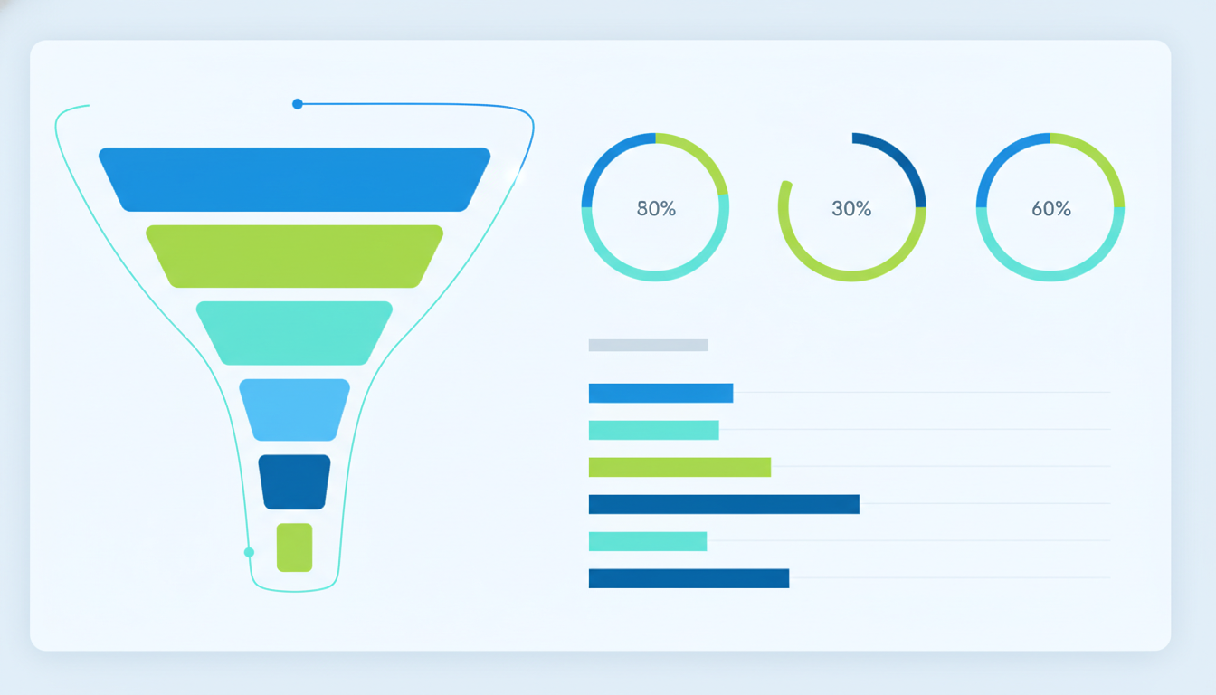
Your dashboard should display the pipeline as both a funnel visualisation (showing volume and value at each stage) and a detailed opportunity list (showing individual deals with their current stage, value, expected close date, and days since last activity). The opportunity list should be sortable and filterable, enabling managers to focus on specific segments, territories, or deal sizes. Highlighting deals that have been stagnant — no stage progression or activity for a defined period — draws attention to opportunities that may need intervention or removal.
Establishing a regular pipeline review cadence is equally important as the dashboard itself. Many successful UK sales organisations hold weekly pipeline reviews where managers and reps walk through the dashboard together, scrutinising deal progression, challenging close dates, and validating pipeline values. The dashboard serves as the single source of truth during these sessions, eliminating the time previously spent reconciling different versions of spreadsheets. Over time, this discipline improves data quality in the CRM because reps know their data will be inspected — creating a virtuous cycle where better data leads to better dashboard insights, which in turn leads to better sales decisions.
Sales Forecasting on Your Dashboard
Forecasting is where a sales dashboard transitions from reporting what has happened to predicting what will happen. Accurate forecasting enables better resource planning, more confident financial projections, and proactive management of pipeline gaps before they become revenue shortfalls.
Forecast Methodologies
There are several forecasting approaches you can implement, each with different strengths. The simplest is weighted pipeline forecasting, which multiplies each deal's value by its stage probability. More sophisticated approaches include historical conversion rate analysis, which uses your actual win rates by stage to predict outcomes, and machine learning models that consider multiple variables including deal size, customer type, competitive situation, and sales rep performance history.
Forecast vs Actual Tracking
Your dashboard should track forecast accuracy over time, comparing predicted outcomes against actual results at monthly and quarterly intervals. This transparency serves two purposes: it builds organisational trust in the forecasting process when accuracy improves, and it identifies systematic biases — such as individual reps who consistently over-forecast or specific deal types that underperform expectations. Displaying forecast accuracy as a rolling metric encourages the disciplined pipeline management that underpins reliable predictions.
Scenario planning takes forecasting a step further by allowing sales leaders to model different outcomes and prepare contingency plans. Your dashboard can include a what-if capability that lets managers adjust assumptions — for example, modelling the impact of losing the two largest deals in the pipeline, or the effect of accelerating close dates on three high-probability opportunities. This functionality is particularly valuable for UK businesses navigating uncertain economic conditions, where the ability to present the board with best-case, expected, and worst-case revenue scenarios demonstrates mature sales leadership and enables more confident strategic decision-making.
CRM Integration Best Practices
Your sales dashboard is only as good as the data feeding it, and for most UK businesses, that data lives in a CRM system. Whether you use Salesforce, HubSpot, Microsoft Dynamics, Pipedrive, or another platform, the integration between your CRM and dashboard must be reliable, timely, and accurate.
The most sophisticated dashboard in the world is worthless if the underlying CRM data is inaccurate, incomplete, or outdated. Establish clear data entry standards — mandatory fields, stage progression rules, close date updating cadences — and enforce them through CRM configuration and management accountability. UK sales teams that implement data hygiene programmes typically see dashboard adoption rates increase by 40-60%, because people use dashboards they trust, and they trust dashboards built on clean data.
Real-Time vs Batch Updates
Consider whether your dashboard needs real-time CRM synchronisation or whether periodic batch updates are sufficient. For most UK sales operations, hourly or twice-daily updates provide an effective balance between data freshness and system performance. Real-time integration is warranted for high-velocity sales environments — inside sales teams handling dozens of deals daily — where stale data could lead to duplicate outreach or missed follow-ups.
Data Enrichment
Enhance your CRM data with external sources to add context that improves dashboard insights. Company data enrichment from providers like Companies House API, Dun and Bradstreet, or ZoomInfo can add industry classification, company size, financial health indicators, and decision-maker information. This enriched data enables more meaningful segmentation on your dashboard — analysing pipeline by industry vertical, company size band, or geographic region — and supports more accurate forecasting by identifying patterns in deal outcomes across different customer profiles.
When implementing data enrichment for your UK sales dashboard, GDPR compliance must be a primary consideration. The UK General Data Protection Regulation and the Data Protection Act 2018 impose strict requirements on how personal data is collected, processed, and stored. Ensure that any third-party data enrichment providers you use are GDPR compliant, that data processing agreements are in place, and that your enrichment processes are documented in your data processing records. Your dashboard should also support role-based access controls so that sensitive customer data is only visible to authorised users, and audit logging should track who accesses what data and when — a requirement that becomes particularly relevant during regulatory audits or data subject access requests.
Dashboard Views for Different Roles
Different stakeholders need different views of sales data. A single dashboard attempting to serve everyone inevitably serves no one well. Design role-specific views that present the right information at the right level of detail for each audience.
| Role | Primary Focus | Key Metrics | Update Frequency |
|---|---|---|---|
| Sales Director | Strategic performance, forecast, team comparison | Revenue vs target, forecast accuracy, pipeline coverage | Daily summary |
| Sales Manager | Team execution, coaching opportunities | Rep performance, activity rates, deal progression | Real-time |
| Sales Rep | Personal pipeline, priority actions | My pipeline, upcoming tasks, personal target progress | Real-time |
| Finance Director | Revenue recognition, cash flow impact | Booked revenue, deferred revenue, payment terms | Weekly |
| CEO / Board | Business health, growth trajectory | Revenue growth, customer acquisition, market share | Monthly |
Custom Dashboards vs Spreadsheet Reporting
Many UK sales teams continue to rely on spreadsheets for their reporting despite the limitations. The contrast between a purpose-built dashboard platform and manual spreadsheet reporting illustrates why the investment in a proper dashboard delivers substantial returns. Consider how the two approaches compare across the capabilities that matter most to sales organisations.
Custom Dashboard Platform
Spreadsheet Reporting
The comparison makes clear that while spreadsheets serve as adequate collaboration tools, they fundamentally lack the real-time data integration, automated alerting, and custom visualisation capabilities that distinguish high-performing sales operations from those still relying on reactive, backward-looking reports. For UK businesses serious about data-driven sales management, the transition from spreadsheet reporting to a dedicated dashboard platform is not merely a technology upgrade — it is a strategic decision that directly impacts revenue outcomes.
Technology Choices for UK Businesses
The UK market offers numerous dashboard platforms, from enterprise solutions like Tableau and Power BI to CRM-native dashboards in Salesforce and HubSpot, and custom-built solutions using web frameworks. Your choice should be guided by your existing technology stack, budget, technical capabilities, and the specific requirements identified earlier in this guide.
Power BI is particularly popular among UK businesses due to its integration with the Microsoft ecosystem, competitive pricing, and strong self-service capabilities. For organisations already invested in Salesforce, the native reporting and dashboard tools — supplemented by Einstein Analytics for advanced capabilities — provide a path that avoids additional platform costs. Custom-built dashboards offer maximum flexibility but require development resources and ongoing maintenance that many UK SMEs find difficult to sustain.
Implementation timelines for dashboard projects vary significantly depending on complexity and integration requirements. A straightforward dashboard pulling data from a single CRM typically takes four to eight weeks from design to deployment. More complex implementations involving multiple data sources, custom integrations, advanced forecasting models, and role-based access controls may require three to six months. UK businesses should plan for a phased rollout — starting with a core set of metrics and one or two user roles, then iterating based on feedback before expanding functionality. This approach reduces risk, accelerates time to value, and ensures the dashboard evolves to genuinely serve its users rather than being imposed from above.
Team Adoption and Change Management
The most beautifully designed dashboard is worthless if your sales team does not use it. Dashboard adoption is a change management challenge as much as a technology challenge, and UK businesses that treat it as such achieve far better outcomes. Start by involving key stakeholders — sales managers, top-performing reps, and finance partners — in the design process. When people contribute to building a tool, they are far more likely to adopt it. Provide thorough training that goes beyond basic navigation to explain how each metric connects to daily sales activities and decision-making. Identify internal champions who can demonstrate the dashboard's value through real examples and encourage peer adoption. Finally, consider retiring the old reporting methods entirely — as long as both the dashboard and the legacy spreadsheet reports coexist, many users will default to the familiar approach they already know.
Measuring Dashboard Effectiveness
A dashboard is a tool, and like any tool, its value should be measured by the outcomes it enables. Track dashboard adoption rates (how many users log in and how frequently), time-to-insight (how quickly managers identify issues), and ultimately the impact on sales outcomes — win rates, forecast accuracy, and revenue attainment before and after dashboard implementation.
Solicit regular feedback from users at all levels and be prepared to iterate on your design. The best sales dashboards evolve continuously, adapting to changing business priorities, new data sources, and user feedback. Schedule quarterly reviews to assess whether the metrics displayed remain relevant, whether the layout supports current workflows, and whether new capabilities would enhance the dashboard's value. Building a sales dashboard is not a one-time project — it is an ongoing commitment to data-driven sales management that pays dividends in improved visibility, faster decisions, and ultimately stronger revenue performance across your UK sales operation.
Establish a dashboard maturity model for your organisation. In the early stages, success means basic adoption — users logging in regularly and referencing the dashboard in meetings. As maturity grows, measure how frequently dashboard insights lead to specific actions: deals reprioritised, resources reallocated, forecasts adjusted. At the highest maturity level, the dashboard becomes embedded in your sales culture — every conversation about performance starts with the dashboard, every strategic decision is supported by data, and continuous improvement to the reporting system is driven by the sales team themselves rather than imposed by management or IT. UK businesses that reach this level of dashboard maturity consistently outperform their competitors in revenue growth, forecast accuracy, and sales team retention.
Build Your Sales Dashboard with Cloudswitched
Cloudswitched designs custom sales reporting dashboards that give your team real-time visibility into pipeline performance, revenue trends, and forecasting accuracy.

CloudSwitched
London-based managed IT services provider offering support, cloud solutions and cybersecurity for SMEs.


