Data visualisation is the bridge between raw numbers and human understanding. In an era where UK businesses generate more data than ever before — from customer transactions and website analytics to operational sensors and financial systems — the ability to present that data visually is what separates organisations that merely collect data from those that genuinely use it to make decisions. A well-crafted chart can communicate in seconds what a spreadsheet of numbers takes minutes to parse, and an interactive dashboard can reveal patterns and correlations that would remain invisible in tabular form.
Yet data visualisation is not simply about making things look attractive. Poor visualisation actively misleads, distorting perceptions and driving flawed decisions. A truncated axis exaggerates a minor trend. A pie chart with twelve slices obscures rather than reveals. A three-dimensional bar chart introduces perspective distortion that makes accurate comparison impossible. For UK businesses making strategic decisions worth millions of pounds, the difference between good and bad visualisation has genuine commercial consequences.
This guide explores the principles and practices of effective data visualisation for business — from choosing the right chart types and applying sound design principles through to building interactive dashboards and mastering the art of storytelling with data. The focus throughout is practical and business-oriented, aimed at UK professionals who need to communicate data effectively to colleagues, clients, stakeholders, and board members.
Why Visualisation Matters for UK Businesses
The human visual system processes images far more rapidly than text or numbers. Research consistently demonstrates that visual presentations are more memorable, more persuasive, and more likely to prompt action than equivalent textual or numerical presentations. For UK businesses operating in competitive markets, this has direct commercial implications across every function from marketing and sales to operations and finance.
Board presentations backed by clear visualisations secure approval more efficiently. Sales proposals with embedded data graphics win more often. Marketing reports with trend visualisations drive better campaign decisions. Operational dashboards with real-time visual monitoring catch problems earlier. In every case, the underlying data is the same — it is the presentation that determines whether that data translates into insight and action or languishes unread in an email attachment.
According to the UK Office for National Statistics, businesses that adopt data-driven decision making are 23% more likely to outperform competitors on customer acquisition and 19% more profitable than those relying on intuition alone. The Confederation of British Industry reports that data literacy, including the ability to interpret and present data visually, ranks among the top five skills gaps affecting UK business performance. Organisations that invest in visualisation capabilities are not merely improving their presentations — they are building a foundational competency that influences strategic quality, operational efficiency, and competitive positioning across every department.
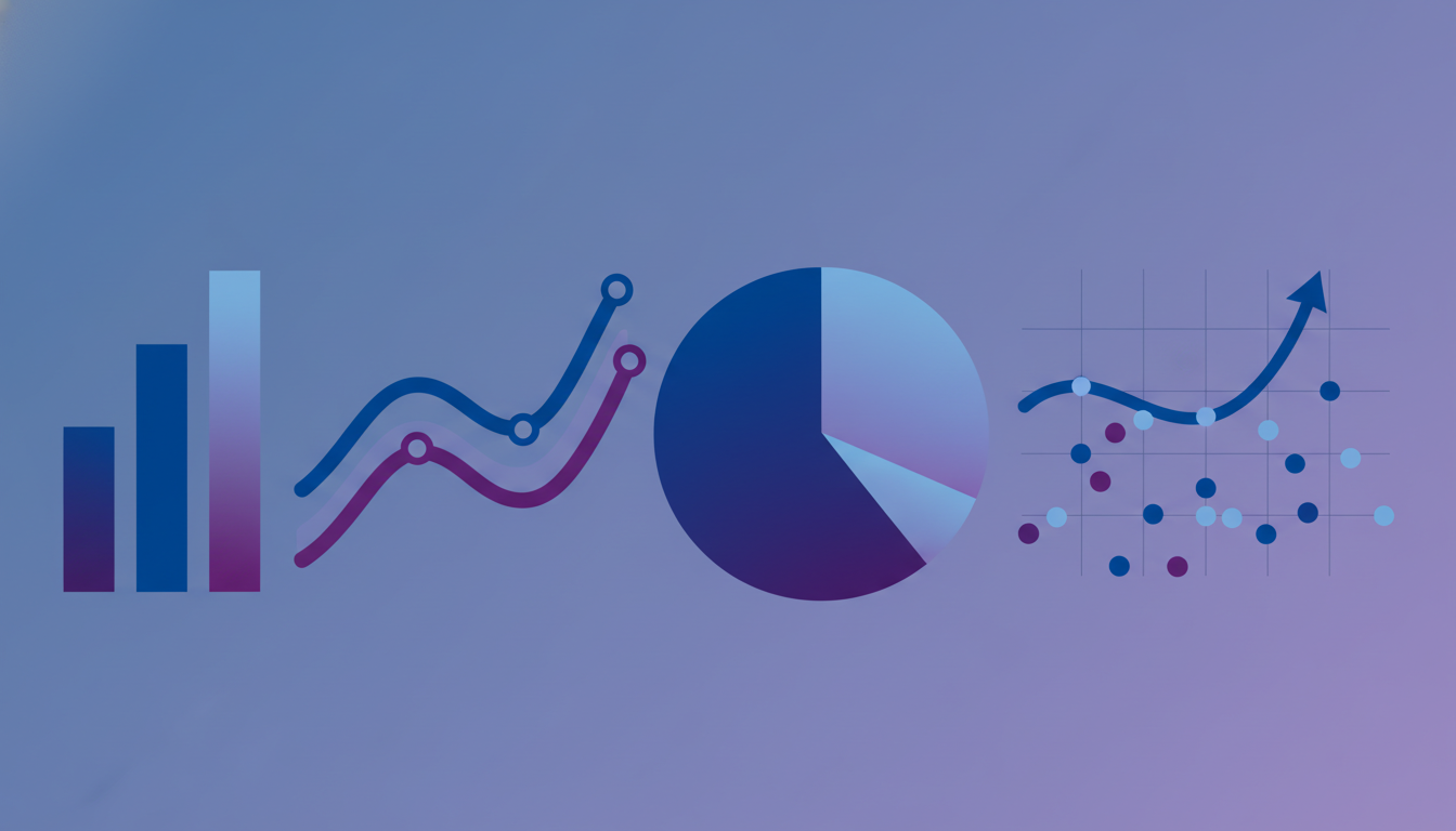
Choosing the Right Chart Type
Selecting the appropriate chart type is the single most important decision in any visualisation. The wrong chart type can make simple data confusing or, worse, suggest patterns and relationships that do not exist. The right chart type makes the data's message immediately apparent, requiring minimal explanation or annotation.
Comparison Charts
When your purpose is to compare values across categories — revenue by region, headcount by department, customer satisfaction by product — bar charts are almost always the correct choice. Horizontal bar charts work particularly well when category labels are long, and grouped or stacked bar charts handle comparisons across multiple dimensions. Avoid using line charts for categorical comparisons, as the connecting lines imply a continuous progression between categories that may not exist.
| Data Relationship | Recommended Chart | Avoid | Why |
|---|---|---|---|
| Trend over time | Line chart, area chart | Pie chart, bar chart | Lines naturally show progression and direction |
| Part of whole | Stacked bar, donut (max 4) | Pie chart (5+ segments) | Humans struggle to compare angles accurately |
| Category comparison | Bar chart (horizontal/vertical) | Line chart, radar chart | Bar length is easily compared visually |
| Correlation | Scatter plot | Dual-axis line chart | Position encoding shows relationships clearly |
| Distribution | Histogram, box plot | Bar chart, pie chart | Shows spread and concentration of values |
| Geographic | Choropleth map, bubble map | Bar chart by region | Spatial relationships are immediately visible |
Trend Charts
For data that changes over time — monthly revenue, weekly website traffic, daily production output — line charts are the standard choice. They show direction, rate of change, and patterns (seasonality, acceleration, plateaus) more effectively than any alternative. Area charts work well when you want to emphasise volume alongside trend, particularly when showing stacked compositions over time. For UK businesses tracking performance against targets, combining a line chart for actuals with a reference line for the target creates an immediately comprehensible performance visual.
Composition Charts
When showing how a total breaks down into its constituent parts, stacked bar charts and treemaps provide clear, accurate representations. Pie charts and donut charts can work for very simple compositions — three or four segments with clearly different sizes — but fail rapidly as complexity increases. If you must use a pie chart, sort segments from largest to smallest starting at the 12 o'clock position, and never use three-dimensional effects that distort the visual proportions.
Pie charts are the most overused and misused chart type in business presentations. Research demonstrates that humans are poor at comparing angles and areas, making pie charts unreliable for communicating precise differences between segments. When two segments are close in size (say 23% and 27%), a pie chart makes them appear nearly identical, while a bar chart makes the difference immediately clear. Reserve pie charts for simple compositions with dramatic differences between segments, and default to bar charts for everything else.
Design Principles for Effective Visualisation
Good visualisation design follows established principles that maximise clarity and minimise cognitive effort. These principles are not merely aesthetic preferences — they are grounded in research on visual perception and information processing.
Data-Ink Ratio
Edward Tufte's concept of the data-ink ratio remains the foundational principle of visualisation design: maximise the proportion of ink (or pixels) devoted to displaying data, and minimise everything else. Remove gridlines that add no information. Eliminate borders around charts. Delete legends when labels can be placed directly on data elements. Reduce colour variation to what is necessary for distinguishing data series. Every visual element that does not communicate data is a distraction that makes the chart harder to read.
Colour Usage
Colour is the most powerful visual encoding available, and also the most frequently misused. Effective colour usage in business visualisation follows three rules. First, use colour to convey meaning, not decoration — red for negative, green for positive, blue for neutral. Second, maintain consistency across all visualisations in your organisation — if blue represents revenue in one chart, it should represent revenue in every chart. Third, ensure accessibility — approximately 8% of men and 0.5% of women in the UK have some form of colour vision deficiency, so never rely on colour alone to distinguish critical data elements. Combine colour with shape, pattern, or direct labelling.
Typography and Annotation
Clear typography makes visualisations accessible. Use a legible sans-serif font at a size that remains readable on the target display device. Label axes clearly with units, format numbers consistently (thousands, millions, percentages), and include the date range or time period covered. Strategic annotation — highlighting a specific data point with a brief note explaining its significance — transforms a chart from passive display into active communication.
Building Interactive Dashboards
Static charts serve well for presentations and reports, but interactive dashboards unlock a deeper level of analytical engagement. When users can filter, drill down, and explore data dynamically, they discover insights that predefined views would never reveal.
Filtering and Drill-Down
Effective dashboard interactivity starts with thoughtful filter design. Provide filters that align with how your users think about the business — by time period, region, product category, customer segment, or team. Cross-filtering, where selecting an element in one chart automatically filters all other charts on the dashboard, creates a fluid exploration experience that encourages deeper investigation. Drill-down capabilities that allow users to click on a summary metric and see the underlying detail complete the analytical journey from overview to insight.
Interactive dashboards must respond quickly to user interactions. Research shows that response times above 2 seconds significantly reduce user engagement and exploration depth. For UK businesses serving dashboard users across different offices — London, Manchester, Edinburgh, Belfast — consider data caching strategies and content delivery optimisation to ensure consistent performance regardless of user location. Pre-aggregating frequently accessed data and implementing incremental refresh patterns helps maintain sub-second response times even with large datasets.
Progressive Disclosure
Not every user needs every detail simultaneously. Design your dashboard using progressive disclosure — showing summary information by default and revealing detail on demand. This approach prevents information overload while ensuring that detailed data is always accessible when needed. Tooltips that display additional context on hover, expandable sections that reveal supporting charts, and linked detail pages that open from summary views all implement progressive disclosure effectively.
Storytelling with Data
The most impactful data communications go beyond simply showing data — they tell a story. Data storytelling combines visualisation with narrative to guide the audience through a logical progression: here is the situation, here is why it matters, and here is what we should do about it. For UK business professionals presenting to boards, investors, or clients, mastering data storytelling is a career-defining skill.
Narrative Structure
Every data story needs a beginning (context and setup), middle (key findings and evidence), and end (conclusions and recommendations). Start by establishing the question or challenge your data addresses. Present the evidence through carefully chosen visualisations, building your argument point by point. Conclude with clear recommendations that flow logically from the evidence presented. This structure works equally well for a ten-minute board presentation and a written analytical report.
Audience Awareness
Tailor your data story to your audience's knowledge level, interests, and decision-making authority. A finance director cares about revenue impact and return on investment. A marketing director cares about customer engagement and campaign performance. A CEO cares about competitive position and strategic direction. The same underlying data can support different stories for different audiences — the art lies in selecting the visualisations and narrative that resonate with each specific group.
Tools for UK Businesses
The UK market offers a rich ecosystem of data visualisation tools spanning every budget and capability level. Choosing the right tool depends on your data sources, technical capabilities, user base, and the types of visualisation you need to create.
| Tool | Best For | Typical UK Cost | Learning Curve |
|---|---|---|---|
| Microsoft Power BI | Microsoft ecosystem, self-service BI | £7.50-£15/user/month | Medium |
| Tableau | Advanced analytics, complex datasets | £50-£70/user/month | Medium-High |
| Looker Studio | Google ecosystem, marketing data | Free | Low-Medium |
| Qlik Sense | Associative data exploration | £20-£40/user/month | Medium |
| D3.js | Custom web-based visualisations | Free (development cost) | High |
Data Visualisation in Regulated Industries
UK businesses operating in regulated sectors face additional considerations when implementing data visualisation. Financial services firms must ensure that customer-facing visualisations comply with FCA guidelines on fair, clear, and not misleading communications. A chart showing investment performance, for example, must include appropriate time periods, benchmarks, and risk warnings — the FCA has fined firms for presenting performance data in ways that overemphasise short-term gains whilst obscuring longer-term volatility.
Healthcare organisations using NHS data must comply with strict information governance requirements, ensuring that visualisations do not inadvertently reveal personally identifiable information through small sample sizes or granular geographic breakdowns. The Caldicott Principles apply to any visual presentation of patient-related data, and NHS Digital provides specific guidance on statistical disclosure control that affects how data can be aggregated and displayed.
In the public sector, the Government Analysis Function sets standards for presenting statistics and data to Parliament and the public. These standards emphasise transparency, reproducibility, and accessibility — all of which have direct implications for visualisation design. Public-facing dashboards must meet WCAG 2.1 AA accessibility standards, which affects colour choices, interactive element design, and the provision of alternative text descriptions for visual content.
Real-Time Visualisation and Monitoring
The growing adoption of real-time data streams across UK businesses creates new opportunities and challenges for visualisation. Manufacturing firms monitoring production lines, logistics companies tracking fleet movements, e-commerce businesses watching transaction volumes, and financial trading operations monitoring market data all require visualisations that update continuously without overwhelming the viewer.
Effective real-time visualisation balances immediacy with stability. A dashboard that flickers and jumps with every data update creates anxiety rather than insight. Techniques like rolling averages, threshold-based alerting (where the visual changes only when metrics cross predefined boundaries), and sparkline summaries help maintain visual stability whilst ensuring that genuinely significant changes are immediately visible. For UK businesses with operations across multiple time zones, real-time dashboards must also handle time zone presentation clearly, ensuring that a viewer in London and a viewer in Singapore are interpreting the same data correctly.
According to a survey by the British Computing Society, 58% of UK organisations that implemented real-time operational dashboards reported measurable improvements in incident response times, with the median improvement being a 34% reduction in time from detection to resolution. The key factor was not the technology itself but the quality of the visualisation design — organisations that invested in thoughtful dashboard design saw twice the improvement of those that simply connected data feeds to default chart widgets.
Custom Database Reporting
Manual Spreadsheet Reports
Accessibility in Data Visualisation
Creating accessible visualisations is both a legal requirement under the Equality Act 2010 and a practical necessity for reaching the widest possible audience. In the UK, approximately 14.1 million people are registered disabled, and many more have conditions that affect how they interact with visual content. Colour blindness alone affects roughly 3 million people in the UK, meaning that any visualisation relying solely on colour to convey meaning is failing a significant portion of its potential audience.
Practical accessibility measures include using patterns or textures alongside colours, providing data tables as alternatives to charts, ensuring sufficient contrast ratios between text and background, and writing meaningful alt-text descriptions for charts embedded in digital documents. Screen reader compatibility requires that charts include structured data in the underlying HTML, not just rendered images. For organisations publishing dashboards externally, testing with assistive technology users during the design phase catches accessibility issues that automated tools miss.
The UK Government Digital Service recommends that all public-facing data visualisations meet WCAG 2.1 Level AA as a minimum, and many private sector organisations are adopting the same standard as part of their corporate accessibility commitments. Meeting these standards is not merely about compliance — accessible visualisations tend to be clearer, simpler, and more effective for all users, not just those with disabilities.
Common Mistakes and How to Avoid Them
Even experienced professionals make visualisation mistakes that undermine their data communications. Being aware of common pitfalls helps you avoid them and produce visualisations that are accurate, clear, and trustworthy.
Truncating the y-axis is perhaps the most dangerous mistake, as it exaggerates small differences and makes minor fluctuations appear dramatic. Unless there is a clear analytical reason to focus on a narrow range (clearly communicated to the viewer), bar charts should always start at zero. Using dual y-axes is another frequent source of confusion — two different scales on the same chart make comparison unreliable and can easily mislead viewers into seeing correlations that do not exist.
Overloading charts with too many data series, excessive labelling, or decorative elements reduces comprehension rather than enhancing it. Cherry-picking time periods or data subsets to support a predetermined conclusion undermines trust and, if discovered, damages professional credibility. Always present data honestly, include relevant context, and acknowledge limitations.
Another common error among UK businesses is neglecting to account for seasonal patterns when presenting trend data. A retailer showing a revenue increase from October to December without acknowledging the Christmas trading period is presenting misleading context. Similarly, comparing year-on-year data without adjusting for calendar effects (such as the number of trading days in a quarter, or the timing of Easter) can produce spurious trends. Always annotate seasonal or calendar-driven effects, and consider using seasonally adjusted figures when the audience might otherwise draw incorrect conclusions from raw data.
UK businesses that build a reputation for accurate, transparent data communication earn the trust of stakeholders, clients, and partners — a competitive advantage that compounds over time as data-driven decision making becomes increasingly central to business success.
Transform Your Data Into Actionable Insights
Cloudswitched builds custom database reporting and visualisation solutions that turn your raw data into clear, interactive dashboards designed for real business decisions. Whether you need executive reporting, operational monitoring, or client-facing analytics, our team delivers purpose-built solutions tailored to your data and your audience.

CloudSwitched
London-based managed IT services provider offering support, cloud solutions and cybersecurity for SMEs.


