Every second your website takes to load costs you visitors, rankings, and revenue. In a world where Google has made page speed a direct ranking factor and users expect pages to load in under three seconds, unoptimised images are one of the most common — and most fixable — performance killers on the web. For UK businesses investing in SEO, image optimisation represents one of the highest-impact, lowest-effort improvements you can make.
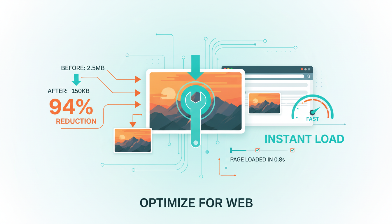
Images typically account for 50% to 75% of a web page's total weight. A single unoptimised hero image can easily exceed 5MB, which on a standard UK broadband connection adds seconds to your load time and on a mobile connection can make your page practically unusable. Multiply that across every page of your website, and you begin to understand why so many otherwise well-designed websites perform poorly in Google's Core Web Vitals assessments.
This guide covers everything you need to know about optimising images for both SEO and performance — from choosing the right file formats and compression techniques to implementing responsive images, lazy loading, and modern delivery methods that will make your website faster and your search rankings stronger.
Why Image Optimisation Matters for SEO
Google has been explicit about the relationship between page speed and rankings. Their Core Web Vitals metrics — Largest Contentful Paint (LCP), Interaction to Next Paint (INP), and Cumulative Layout Shift (CLS) — directly measure aspects of page performance that images heavily influence. LCP, which measures how quickly the largest visible element loads, is often determined by the hero image or the largest product photo on the page. CLS, which measures visual stability, is frequently caused by images that load without defined dimensions, causing content to shift as they appear.
Beyond these direct ranking factors, page speed affects user behaviour in ways that indirectly impact your search performance. Research from Google shows that as page load time increases from one second to three seconds, the probability of a user bouncing increases by 32%. At five seconds, that probability jumps to 90%. High bounce rates and low engagement send negative signals to Google about your content's quality and relevance.
Image optimisation also opens up a significant traffic channel that many businesses overlook entirely: Google Image Search. Image search accounts for approximately 22% of all Google searches, and properly optimised images with descriptive file names, alt text, and structured data can drive substantial traffic to your website. For visually oriented industries — fashion, interior design, food, travel — image search traffic can rival traditional organic traffic.
Choosing the Right Image Format
The first decision in image optimisation is selecting the appropriate file format. Each format has specific strengths and ideal use cases, and choosing correctly can reduce file sizes by 50% or more without any visible loss in quality.
WebP: The Modern Standard
WebP is a modern image format developed by Google that provides superior lossless and lossy compression for images on the web. WebP images are typically 25-35% smaller than comparable JPEG images and 26% smaller than PNG images at equivalent quality levels. Browser support for WebP is now effectively universal, with all major browsers including Chrome, Firefox, Safari, and Edge supporting the format.
For most images on your website — photographs, product images, blog illustrations — WebP should be your default format. The quality-to-file-size ratio is simply better than any legacy format, and the broad browser support means you can use it with confidence.
AVIF: The Next Generation
AVIF is an even newer format that offers compression improvements of 20-50% over WebP. However, browser support, while growing, is not yet universal — notably, some older Safari versions and Edge versions have limited support. AVIF is best used as a progressive enhancement, served to browsers that support it while falling back to WebP or JPEG for those that do not.
JPEG, PNG, and SVG: When to Use Legacy Formats
JPEG remains appropriate as a fallback format for photographs and complex images where broad compatibility is essential. PNG is the correct choice for images requiring transparency (logos, icons, overlays) when SVG is not suitable. SVG is ideal for vector graphics, logos, icons, and illustrations — it scales infinitely without quality loss and typically produces very small file sizes for graphical content.
Compression: Finding the Quality Sweet Spot
Image compression is the process of reducing file size while maintaining acceptable visual quality. There are two types of compression: lossless, which reduces file size without any quality degradation, and lossy, which achieves greater file size reductions by discarding some visual data.
For photographs and complex images, lossy compression at quality levels of 75-85% typically produces files that are indistinguishable from the original to the human eye while being 60-80% smaller. The key is finding the threshold below which quality degradation becomes noticeable — this varies by image type and content.
For graphics, logos, and images with text, lossless compression or very high quality lossy compression is preferable, as artifacts from aggressive compression are more noticeable in these types of images. Text and sharp edges are particularly susceptible to compression artifacts.
Use progressive JPEG encoding for any images you serve in JPEG format. Progressive JPEGs load in successive passes, showing a low-quality version of the entire image first and then progressively sharpening. This improves perceived load time because users see something immediately rather than waiting for the image to load line by line from top to bottom.
Compression Tools and Workflows
Several tools are available for compressing images effectively. For individual images, browser-based tools like Squoosh (developed by Google's Chrome team) provide excellent control over compression settings with real-time quality previews. For batch processing, command-line tools like ImageMagick, Sharp (for Node.js), and libvips offer programmable compression pipelines.
For WordPress sites — which power a significant proportion of UK business websites — plugins like ShortPixel, Imagify, and Smush can automate image optimisation on upload. These plugins compress images, convert to WebP where supported, and can even serve different formats to different browsers automatically.
If you use a CDN (Content Delivery Network), many CDN providers including Cloudflare, Fastly, and Imgix offer automatic image optimisation at the edge, compressing and converting images on-the-fly based on the requesting browser's capabilities. This approach is particularly effective because it removes the need to manage multiple image versions and ensures every user receives the optimal format.
Responsive Images: Serving the Right Size
One of the most common image optimisation mistakes is serving a single, large image to all devices. A hero image that needs to be 1920 pixels wide on a desktop monitor is wasteful on a mobile phone with a 375-pixel-wide screen. Responsive images solve this problem by allowing you to specify multiple versions of an image and letting the browser choose the most appropriate one.
The HTML srcset and sizes attributes enable responsive image delivery. The srcset attribute provides a list of image files at different resolutions, while the sizes attribute tells the browser how wide the image will be at different viewport widths. The browser then selects the most appropriate image, downloading only what it needs.
The <picture> element provides even more control, allowing you to specify different image sources for different conditions — including different formats, different aspect ratios for different screen sizes, and art-directed crops that work better on smaller screens. This is particularly useful for hero images and feature images where the composition matters.
As a general rule, create image versions at widths of 320px, 640px, 960px, 1280px, and 1920px. This covers the most common device widths without creating an unmanageable number of image variants. For retina displays, the browser will automatically select a higher-resolution version when needed, provided you include appropriately sized options in your srcset.
Lazy Loading: Prioritising What Matters
Lazy loading defers the loading of images that are not currently visible in the viewport. Instead of loading every image on the page when the page first loads — including images far below the fold that the user may never scroll to — lazy loading loads images only as they approach the viewport.
Native lazy loading is now built into HTML with the loading="lazy" attribute. Adding this single attribute to your image tags tells the browser to defer loading until the image is close to the viewport. It is widely supported across all modern browsers and requires no JavaScript.
Never lazy load images that appear above the fold — particularly your LCP element. Lazy loading above-the-fold images delays their rendering and will harm your Largest Contentful Paint score. Only apply lazy loading to images below the initial viewport. For your hero image and other above-the-fold images, use loading="eager" (the default) and consider adding fetchpriority="high" to ensure they load as quickly as possible.
For images below the fold, lazy loading can dramatically reduce initial page load time and data transfer. On a typical blog post with ten images, lazy loading might reduce initial page weight by 70-80%, because only the first one or two images need to load immediately.
Image SEO: Alt Text, File Names, and Structured Data
Optimising images for performance is only half the equation. To maximise the SEO value of your images, you also need to ensure they are properly optimised for search engines to understand and index.
Writing Effective Alt Text
Alt text (alternative text) serves two critical purposes: it provides a text description for screen readers used by visually impaired users, and it helps search engines understand the content of your images. Good alt text is descriptive, concise, and naturally incorporates relevant keywords without stuffing.
A photograph of a dental practice reception area in Manchester should have alt text like "Modern reception area at City Centre Dental Practice in Manchester" rather than "reception" (too vague) or "best dentist Manchester dental practice reception area dental surgery Manchester" (keyword stuffed). Describe what the image shows honestly and specifically.
Decorative images that do not convey meaningful content — background textures, visual separators, purely aesthetic elements — should have empty alt attributes (alt="") to indicate to screen readers that they can be skipped. This improves accessibility without adding noise to the image search index.
Descriptive File Names
Rename your image files before uploading them. A file named "IMG_20240315_142736.jpg" tells search engines nothing about the image content. A file named "manchester-dental-practice-reception.jpg" provides clear signals about what the image depicts. Use hyphens to separate words, keep names concise but descriptive, and include relevant keywords naturally.
Image Sitemaps
For websites with large numbers of images — product catalogues, portfolios, galleries — an image sitemap helps Google discover and index your images more efficiently. Image sitemaps can include metadata such as the image's caption, title, geographic location, and licence information, all of which can enhance how your images appear in search results.
Good Image SEO Practices
- Descriptive file names with hyphens (e.g. manchester-dental-reception.jpg)
- Concise, accurate alt text with natural keyword usage
- Empty alt attributes on purely decorative images
- Image sitemap submitted for large visual catalogues
- Unique, specific alt text for every meaningful image
Poor Image SEO Practices
- Generic camera file names (e.g. IMG_20240315_142736.jpg)
- Missing alt text or aggressive keyword stuffing
- Alt text on decorative images cluttering screen readers
- No image sitemap, relying solely on crawl discovery
- Duplicate boilerplate alt text repeated across every page
Core Web Vitals and Images: A Technical Deep Dive
Understanding exactly how images affect Core Web Vitals helps you prioritise your optimisation efforts where they will have the greatest impact.
Largest Contentful Paint (LCP)
LCP measures the time it takes for the largest visible element to render. In over 70% of cases, the LCP element is an image — typically the hero image or the largest above-the-fold image. To optimise LCP for images, ensure your LCP image is compressed, properly sized, served in a modern format, and preloaded using a <link rel="preload"> tag in your HTML head.
Cumulative Layout Shift (CLS)
CLS measures visual stability — how much the page content shifts as elements load. Images are a common cause of layout shift when they load without explicit width and height attributes. Without these dimensions, the browser does not know how much space to reserve for the image, so content below the image shifts when it finally loads.
The fix is straightforward: always include width and height attributes on your image tags, or use the CSS aspect-ratio property. This allows the browser to reserve the correct space before the image loads, preventing layout shift entirely.
Advanced Image Optimisation Techniques
Beyond the fundamentals, several advanced techniques can further improve your image performance and SEO.
Content Delivery Networks (CDNs)
Serving images through a CDN ensures they are delivered from a server geographically close to the user. For UK businesses targeting a UK audience, this means your images load from UK-based edge servers rather than from your origin server, which might be hosted anywhere. CDNs also provide automatic caching, which means returning visitors load images almost instantly from their browser cache or from a nearby edge server.
Image CDNs with Automatic Optimisation
Specialised image CDNs like Cloudinary, Imgix, and Cloudflare Images go beyond simple delivery to provide automatic optimisation. They can resize, compress, convert formats, and apply transformations on-the-fly based on URL parameters. This means you upload a single high-quality original and the CDN automatically serves the optimal version to each user based on their device, browser, and connection speed.
Client Hints and Content Negotiation
Modern browsers can send client hints — HTTP headers that tell the server about the device's capabilities, viewport width, connection speed, and preferred image formats. Servers and CDNs that support client hints can use this information to deliver perfectly optimised images without any client-side logic or complex HTML markup.
Placeholder and Progressive Loading Strategies
Low-quality image placeholders (LQIP) and blur-up techniques show a tiny, heavily compressed version of the image while the full image loads. This provides immediate visual feedback, improves perceived performance, and creates a smooth transition as the full image appears. These techniques are particularly effective for image-heavy pages and can significantly improve user experience on slower connections.
An Image Optimisation Checklist
Implementing comprehensive image optimisation across your website can feel overwhelming, but breaking it down into systematic steps makes it manageable. Start with the highest-impact changes and work through progressively more advanced techniques as time and resources allow.
Begin by auditing your current image performance. Run your website through Google PageSpeed Insights, which will identify specific images that are slowing down your pages and estimate the potential savings from optimising them. Review your Core Web Vitals data in Google Search Console to identify pages where images are causing LCP or CLS issues.
Next, address the fundamentals: convert images to WebP, compress them appropriately, resize them to their maximum display dimensions, and add proper alt text and descriptive file names. These basic steps alone can reduce page weight by 50-70% and significantly improve your Core Web Vitals scores.
Then, implement responsive images with srcset and sizes attributes, add lazy loading to below-the-fold images, and ensure all images have explicit dimensions to prevent layout shift. These techniques build on the fundamentals and provide further performance improvements.
Finally, explore advanced techniques like CDN-based image delivery, automatic format negotiation, preloading for critical images, and progressive loading strategies. These refinements squeeze out the last increments of performance and provide the best possible experience for your users.
| Technique | Effort | Impact | Priority |
|---|---|---|---|
| Convert to WebP format | Low | 25-35% size reduction | Immediate |
| Compress images (quality 75-85%) | Low | 60-80% size reduction | Immediate |
| Add proper alt text | Low | SEO + accessibility | Immediate |
| Set explicit width/height | Low | Eliminates CLS issues | Immediate |
| Implement lazy loading | Low | 70-80% initial load reduction | High |
| Responsive images (srcset) | Medium | 30-50% mobile savings | High |
| Preload LCP image | Low | Faster LCP score | High |
| CDN delivery | Medium | Faster global delivery | Medium |
| Automatic format negotiation | Medium | Optimal format per browser | Medium |
| AVIF with WebP fallback | Medium | Additional 20-50% savings | Medium |
Need Help Speeding Up Your Website?
Image optimisation is just one part of a comprehensive technical SEO strategy. Our team can audit your website's performance, implement optimisations, and ensure your Core Web Vitals meet Google's standards for a ranking advantage.
Explore Our SEO ServicesThe Business Case for Image Optimisation
For UK businesses weighing whether to invest time and resources in image optimisation, the business case is compelling. Faster pages lead to better user engagement, lower bounce rates, higher conversion rates, and improved search rankings. These are not marginal gains — research consistently shows that every 100-millisecond improvement in page load time can increase conversion rates by up to 8%.
For e-commerce sites, where product images are central to the customer experience, optimised images mean faster product page loads, smoother browsing experiences, and more completed purchases. For service businesses, faster loading professional images build trust and credibility more effectively than slow-loading ones that frustrate users before they even read your content.
Image optimisation is also one of the most sustainable SEO improvements you can make. Unlike content that may need regular updating or backlinks that require ongoing effort to maintain, a well-implemented image optimisation pipeline continues to deliver benefits automatically as you add new content to your website. Set it up properly once, and it works for you indefinitely.
The bottom line is straightforward: unoptimised images are costing you visitors, rankings, and revenue right now. The tools, techniques, and knowledge to fix this are readily available. The only question is whether you will act on them before your competitors do.

CloudSwitched
London-based managed IT services provider offering support, cloud solutions and cybersecurity for SMEs.


