Your website form is the moment of truth. Everything else — the compelling homepage, the carefully crafted service pages, the search engine optimisation, the social media campaigns — exists to drive visitors to the point where they fill in a form and become a lead, a customer, or a subscriber. Yet most UK business websites lose between 70% and 90% of the people who start filling in a form before they complete it. That is not a minor inefficiency — it is a catastrophic failure at the most critical step in your sales process.
The frustrating reality is that most form abandonment is entirely preventable. It is caused by forms that are too long, ask for unnecessary information, have confusing layouts, fail on mobile devices, or simply make the process feel harder than it needs to be. Fixing these issues does not require a complete website redesign or expensive technology — it requires understanding what makes people abandon forms and systematically eliminating those barriers.
This guide draws on conversion rate optimisation research, UX best practices, and real-world data from UK business websites to show you exactly how to create forms that people actually complete.
Why People Abandon Forms
Before we discuss solutions, we need to understand the problem. Research into form abandonment consistently identifies the same core reasons, regardless of industry or audience.
The number one reason is length. Forms that ask for too much information trigger an immediate cost-benefit calculation in the visitor's mind: "Is what I am getting worth the effort of filling all this in?" For most enquiry forms, the answer is no. Every additional field you add reduces your completion rate. Research from the Baymard Institute found that reducing form fields from 11 to 4 increased conversions by 120%.
The second most common reason is irrelevant or intrusive questions. Asking for a phone number on a newsletter signup form, requesting a company size before someone has even had a conversation with you, or demanding a postal address when you have no intention of sending physical mail — these all signal to the visitor that you value your data collection more than their time.
Other significant factors include poor mobile experience (forms that are difficult to tap and fill on a phone), lack of clarity about what happens after submission, confusing validation messages, no progress indication on multi-step forms, and privacy concerns about how submitted data will be used.
The Principles of High-Converting Forms
Principle 1: Ask Only What You Absolutely Need
Every field on your form should pass the "first conversation" test: would you ask this question in the first 30 seconds of meeting someone at a networking event? You would ask their name and what they need help with. You would not ask for their date of birth, annual turnover, or how they heard about you. Apply the same logic to your forms.
For a standard contact or enquiry form, the optimal fields are: name (one field, not separate first name and last name), email address, and message or enquiry. That is three fields. If you absolutely need a phone number, make it optional and explain why you are asking. Everything else can be gathered during follow-up conversations.
High-Converting Form
- 3-5 fields maximum
- Single name field (not first/last separately)
- Clear, descriptive labels above fields
- Large, tappable fields on mobile
- Specific, action-oriented submit button
- Inline validation with helpful messages
- Privacy assurance near the submit button
- Clear confirmation after submission
Low-Converting Form
- 10+ fields including irrelevant ones
- Separate first name, last name, title fields
- Placeholder text instead of labels
- Tiny fields that are hard to tap on mobile
- Generic "Submit" button with no context
- Validation only after clicking submit
- No mention of data privacy or GDPR
- Redirect to homepage after submission
Principle 2: Design for Mobile First
Over 60% of web traffic in the UK now comes from mobile devices. If your form is not optimised for mobile, you are losing the majority of your potential conversions. Mobile form design requires several specific considerations.
Use a single-column layout. Side-by-side fields that look elegant on desktop become cramped and confusing on a phone screen. Stack all fields vertically. Make input fields at least 44 pixels tall — this is Apple's recommended minimum tap target size and ensures users can easily select the field without accidental taps. Use the correct input types so that mobile browsers display the appropriate keyboard — type="email" shows the @ symbol, type="tel" shows a numeric keypad, type="url" shows the forward slash key.
Principle 3: Write Submit Buttons That Describe the Action
The submit button is the most important element on your form, yet most businesses use a generic "Submit" or "Send" label that tells the user nothing about what happens next. Replace generic labels with specific, benefit-oriented text that describes the outcome of clicking the button.
Instead of "Submit", try "Get Your Free Quote", "Book My Consultation", "Send My Enquiry", or "Start My Free Trial". Research consistently shows that specific button labels outperform generic ones by 15-30%. The button should also be visually prominent — use a contrasting colour, generous padding, and full-width on mobile devices.
A Manchester-based digital agency changed their contact form button from "Submit" to "Get My Free Website Review" and saw a 34% increase in form completions. The form itself did not change — only the button text. This single change generated an additional 12 enquiries per month, resulting in approximately £28,000 in additional annual revenue. Button copy matters more than almost any other element on the form because it is the last thing a person sees before committing to an action.
Principle 4: Use Inline Validation Done Right
Validation — checking that form inputs are correct — is necessary but often implemented poorly. The worst approach is validating only when the user clicks submit, presenting a list of errors at the top of the page that requires scrolling back up to find and fix each issue. This is the single most frustrating form experience and a major driver of abandonment.
Instead, use inline validation that checks each field as the user moves to the next one. If the email address is invalid, show a helpful message immediately below the email field — not at the top of the page after they have already filled in everything else. Use green checkmarks for valid entries to provide positive reinforcement, and write error messages that explain the problem clearly: "Please enter a valid email address (e.g., name@company.co.uk)" rather than "Invalid input".
Principle 5: Build Trust Around the Form
People hesitate to share personal information online, and rightfully so. Your form needs to address these concerns directly. Include a brief privacy statement near the submit button — something like "We take your privacy seriously. Your data is protected under GDPR and will never be shared with third parties." If applicable, display trust signals near the form: security badges, client logos, Cyber Essentials certification marks, or testimonial quotes.
Under the UK GDPR, you are legally required to inform users how their data will be used before collecting it, obtain consent for marketing communications, and provide a link to your privacy policy. These are not just legal obligations — they are conversion tools. Users who feel confident about how their data will be handled are significantly more likely to complete your form.
| Form Element | Best Practice | Impact on Conversion |
|---|---|---|
| Number of Fields | 3-5 maximum for enquiry forms | Each additional field reduces conversions by ~7% |
| Field Labels | Clear text above the field (not placeholder) | Above-field labels outperform placeholders by 25% |
| Submit Button | Specific, action-oriented text with contrast colour | Specific labels increase clicks by 15-30% |
| Mobile Layout | Single column, 44px minimum tap targets | Responsive forms convert 50% better on mobile |
| Validation | Inline, immediate, with helpful error messages | Reduces abandonment by up to 22% |
| Privacy Assurance | Brief statement near submit button | Increases trust and completion by 10-19% |
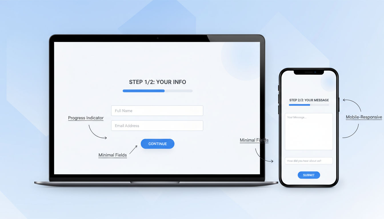
Multi-Step Forms: When and How
If your form genuinely requires more than five fields — a detailed quote request or a registration process, for example — consider breaking it into multiple steps. Multi-step forms consistently outperform equivalent single-page forms because they reduce the perceived effort at each step.
The key to effective multi-step forms is clear progress indication (a step counter or progress bar), logical grouping of fields into steps, the ability to go back and edit previous steps, and starting with the easiest questions first. The first step should require minimal effort — just a name and email, perhaps — to commit the user to the process. Once someone has completed step one, they are psychologically invested and far more likely to complete the remaining steps.
Conditional Logic and Smart Forms
One of the most effective ways to keep forms short whilst still collecting necessary information is conditional logic — showing or hiding fields based on a user's previous answers. Rather than presenting every possible field upfront and overwhelming the visitor, a smart form reveals additional questions only when they are relevant.
For example, a web development enquiry form might start with a simple question: "What type of project are you interested in?" with options like "New Website," "Website Redesign," "E-commerce," or "Web Application." Depending on the selection, the form then reveals relevant follow-up questions. Someone selecting "E-commerce" might see questions about product volume and payment processing, whilst someone selecting "Website Redesign" might be asked about their current website URL.
According to a 2024 study by Formstack, forms using conditional logic see completion rates up to 30% higher than static forms of equivalent total length. The psychological benefit is clear: users only see what is relevant to them, making the form feel shorter and more personalised. UK businesses implementing conditional logic on quote request forms have reported significant improvements in both completion rates and lead quality, as the data collected is more targeted and actionable.
Accessibility: Forms That Everyone Can Complete
An often overlooked aspect of form design is accessibility. In the UK, approximately 16 million people — roughly one in four of the population — live with some form of disability. The Equality Act 2010 requires businesses to make reasonable adjustments to ensure their services are accessible, and this extends to digital services including website forms. Beyond legal compliance, accessible forms convert better for everyone.
Start with proper semantic HTML. Every form field should have an associated label element linked via the "for" attribute. This is essential for screen reader users but also benefits sighted users by increasing the clickable area of each field. Avoid using placeholder text as a substitute for labels — placeholders disappear when the user begins typing, leaving them without context for what the field requires.
Ensure sufficient colour contrast between text and backgrounds. The Web Content Accessibility Guidelines (WCAG) 2.1, which are referenced by UK government accessibility standards, require a minimum contrast ratio of 4.5:1 for normal text. Error messages should not rely solely on colour to communicate — include text descriptions and icons so that colour-blind users can understand the issue.
Tab order matters enormously for keyboard users. Ensure that users can navigate through your form in a logical sequence using only the Tab key. Add visible focus indicators so keyboard users can see which field is currently active. Test your form by filling it in using only your keyboard — if you encounter any difficulties, so will your visitors.
According to the Click-Away Pound Survey, UK businesses lose approximately £17.1 billion per year from disabled customers who cannot access their websites. Making your forms accessible is not just ethically right — it is commercially sensible. Accessible forms are also better forms: the discipline of clear labelling, logical structure, and helpful feedback benefits every single user.
What Happens After Submission
The post-submission experience is often neglected, but it significantly impacts how visitors perceive your business and whether they become customers.
After someone submits your form, they should immediately see a clear confirmation message — not a generic "Thank you for your submission" but something warm and specific: "Thanks, [Name]. We have received your enquiry and a member of our team will be in touch within 2 working hours." Set clear expectations about what happens next and when they will hear from you.
Send an immediate automated email confirming receipt of their enquiry. This serves two purposes: it reassures the visitor that their submission was received, and it gets your brand into their inbox while your business is fresh in their mind. Then follow up personally within the timeframe you promised. Research shows that leads contacted within five minutes are 21 times more likely to convert than those contacted after 30 minutes.
GDPR Compliance and Data Handling for UK Forms
Since the UK left the European Union, data protection is governed by the UK GDPR and the Data Protection Act 2018, enforced by the Information Commissioner's Office (ICO). For website forms, compliance is not merely a checkbox exercise — it directly affects both your legal standing and your conversion rates.
Every form that collects personal data must have a lawful basis for processing. For most business enquiry forms, this is "legitimate interest" — you have a legitimate business reason to process the data someone voluntarily submits. However, for marketing communications (newsletters, promotional emails), you typically need explicit consent via an unticked checkbox. Pre-ticked boxes are not valid consent under UK GDPR.
Your form should link to a clear, accessible privacy policy that explains what data you collect, why you collect it, how long you retain it, who you share it with, and how individuals can exercise their rights (access, rectification, erasure). The ICO recommends using layered privacy notices — a brief summary near the form with a link to the full policy for those who want more detail.
Data minimisation is a core principle of UK GDPR and aligns perfectly with form optimisation best practice. You should only collect data that is adequate, relevant, and limited to what is necessary for the specified purpose. If you are running a contact form, collecting someone's date of birth or National Insurance number would be both a GDPR concern and a conversion killer. The regulation effectively mandates good form design.
Record consent properly. When someone ticks a marketing consent checkbox, record the date, time, the specific wording they agreed to, and the method of consent. If the ICO ever investigates, you need to demonstrate exactly what each person consented to and when. This is particularly important since ICO fines for GDPR breaches can reach up to £17.5 million or 4% of annual global turnover, whichever is higher.
Form Analytics: The Metrics That Matter
You cannot improve what you do not measure. Set up tracking to monitor your form's performance using these key metrics: form views (how many people see the form), form starts (how many people interact with a field), form completions (how many people submit), completion rate (completions divided by starts), and abandonment rate (1 minus completion rate).
Google Analytics 4 can track form interactions with proper event configuration. Tools like Hotjar or Microsoft Clarity provide heatmaps and session recordings that show exactly how visitors interact with your form — where they hesitate, which fields they struggle with, and where they abandon. This data is invaluable for identifying specific problems and testing solutions.
Beyond basic completion metrics, track field-level data to identify exactly where users drop off. Most form analytics tools can show you which specific field causes the most abandonment. Common culprits include phone number fields (which many users are reluctant to share), fields requiring information the user does not have to hand (like account numbers or reference codes), and open-ended text areas where users are unsure what to write.
UK benchmarks provide useful context for evaluating your form performance. According to data from Zuko Analytics, the average form completion rate across UK business websites is approximately 33%, meaning two-thirds of people who start a form never finish it. However, top-performing forms achieve completion rates of 60% or higher. If your form falls below the 33% benchmark, there are almost certainly quick wins available. If you are already above average, more nuanced optimisation can still yield meaningful improvements.
A/B Testing Your Forms: A Systematic Approach
Conduct A/B tests to continuously improve your form. Test one variable at a time — the number of fields, the button text, the layout, the presence of trust signals — and measure the impact on completion rate. Even small improvements compound over time. A 10% improvement in form completions, sustained over a year, could represent dozens of additional leads and significant additional revenue.
The most impactful A/B tests for UK business forms typically involve the following variables, ranked by average conversion lift observed in studies: reducing the number of fields (average 25-50% improvement), changing the submit button text (15-30% improvement), adding or repositioning trust signals (10-20% improvement), switching from single-page to multi-step layout (15-25% improvement), and adding or removing specific field types like phone numbers (5-15% improvement).
When running A/B tests, ensure you collect enough data to reach statistical significance — typically at least 100 conversions per variation. For lower-traffic UK business websites, this may mean running tests for several weeks. Resist the temptation to call a test early based on preliminary results. Many apparent winners reverse when given more time, and acting on insufficient data can actually decrease your conversion rate.
Document every test you run, including the hypothesis, the variations tested, the sample size, and the result. Over time, this testing log becomes an invaluable resource that helps you understand what works specifically for your audience — because what works for an e-commerce checkout in London may not work for a professional services enquiry form in Edinburgh.
Industry-Specific Form Strategies for UK Businesses
Different industries have different form requirements, and a one-size-fits-all approach rarely delivers optimal results. Here are tailored recommendations for some of the most common UK business sectors.
Professional services (accountants, solicitors, consultants): Trust is paramount. Include professional accreditation badges near the form (ACCA, SRA, CMI logos). Use formal but warm language. Keep the form to name, email, and a brief description of requirements. Avoid asking for financial details at the form stage — these can be gathered during the initial consultation.
E-commerce: Checkout forms are where most revenue is lost. Offer guest checkout prominently — requiring account creation before purchase is the number one cause of UK e-commerce cart abandonment. Auto-detect postcode from the first part of the address. Offer address lookup via the Royal Mail PAF database to reduce typing. Display accepted payment methods and security badges prominently.
B2B technology and SaaS: Decision-making cycles are longer, so forms should focus on starting a conversation rather than closing a sale. Offer high-value content (whitepapers, case studies, ROI calculators) in exchange for contact details. Keep initial forms short (name, work email, company name) and use progressive profiling to gather additional data over multiple interactions.
Healthcare and wellness: Privacy sensitivity is heightened. Be explicit about how health-related data will be handled, stored, and protected. If collecting medical information, ensure your form processing complies with Caldicott Principles and the Data Protection Act 2018 special category data requirements. Use reassuring language and consider offering a phone number alternative for users who prefer not to share health details online.
Trades and home services (plumbers, electricians, builders): Speed is everything — these customers often have urgent needs. Minimise the form to name, phone number, postcode, and a brief description of the job. Offer a prominent click-to-call button as an alternative. Display availability and response time commitments prominently near the form, for example: "We aim to respond within 30 minutes during business hours."
Ready to Transform Your Website Forms?
Cloudswitched specialises in designing and building high-converting websites for UK businesses. Our web development team combines conversion rate optimisation expertise with clean, accessible design to create forms that visitors actually complete. Whether you need a complete website overhaul or targeted form optimisation, we can help you turn more visitors into leads and customers.
Final Thoughts
Your website form is arguably the most valuable element on your entire website. It is where interest becomes action, where visitors become leads, and where your marketing investment converts into business opportunities. Treating form design as an afterthought is one of the most expensive mistakes a UK business can make.
Apply the principles in this guide — reduce fields, design for mobile, write specific button labels, validate inline, build trust, ensure accessibility, and comply with UK GDPR — and you will see a meaningful increase in form completions. More completions mean more leads, more leads mean more customers, and more customers mean a more successful business. The maths is simple. The execution requires attention to detail, but the rewards are substantial.
Remember that form optimisation is not a one-time project. User expectations evolve, technology changes, and your business grows. Schedule quarterly form audits to review your analytics, test new ideas, and ensure your forms continue to perform at their best. The businesses that treat their forms as living, evolving assets — rather than static features built once and forgotten — are the ones that consistently outperform their competition in lead generation and customer acquisition.

CloudSwitched
London-based managed IT services provider offering support, cloud solutions and cybersecurity for SMEs.


